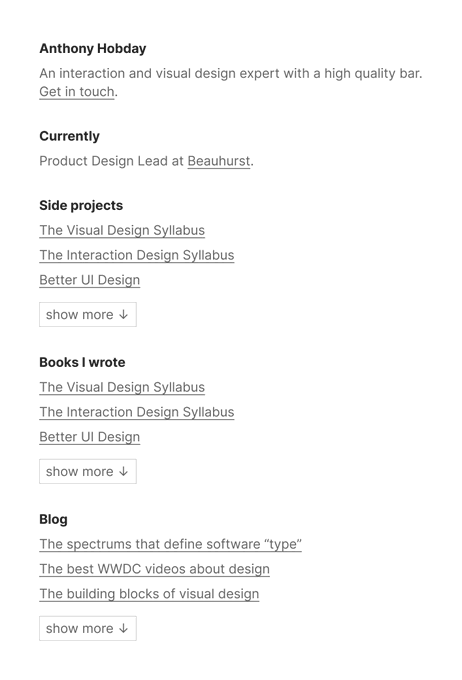
Anthony Hobday Profile Banner
Anthony Hobday Profile
Anthony Hobday

@hobdaydesign

12,975
Followers
18
Following
2,678
Media
10,921
Statuses

I think about interface design all day. Visit my website for paid design advice, side projects, blog posts, and books.

England
Joined April 2021
Don't wanna be here? Send us removal request.
@hobdaydesign
Anthony Hobday
1 year
Someone sent me a question about imagery in website hero sections, so here's some thoughts/ideas/inspiration, with examples. 1. The standard approach is to have text content (headings, text, buttons) and imagery (photos, illustrations) side-by-side.
Tweet media one
Tweet media two
Tweet media three
Tweet media four
85
565
4K
@hobdaydesign
Anthony Hobday
1 year
@nealagarwal Must be stronger than the previous sign-up’s password
5
9
2K
@hobdaydesign
Anthony Hobday
1 year
The @stripe sessions website goes hard. It demonstrates the lengths Stripe is willing to go to when it comes to web design. Here are the details that catch my eye. I'll get the small details out of the way first, before I spend far too long on colour, which is the star here.
Tweet media one
34
161
2K
@hobdaydesign
Anthony Hobday
1 month
After years of sightings in memes, I finally faced the ultimate interface design challenge: a dialogue that asks you if you're sure that you want to cancel something. I think I threaded this needle quite well.
Tweet media one
23
137
2K
@hobdaydesign
Anthony Hobday
1 year
Putting content in containers makes the structure of the layout easier to understand, which is usually a good thing. Here are some good examples, for inspiration. Honk, Apple, Alfread, Mailchimp.
Tweet media one
Tweet media two
Tweet media three
Tweet media four
29
151
2K
@hobdaydesign
Anthony Hobday
1 year
I've updated my list of visual design rules you can safely follow every time to add rules about nested corners and hard dividers. Up to 25 rules now. I've also tweaked the explanations to make it clearer why they're good rules to follow.
Tweet media one
33
166
1K
@hobdaydesign
Anthony Hobday
1 year
People have noticed @bolt 's new logo, but don't miss the on-brand motifs through their website. Excellent attention to detail. All of these echo the bolt logo. 1) These tabs at the top of the website have angled sides.
Tweet media one
30
99
1K
@hobdaydesign
Anthony Hobday
1 year
Here are some of my favourite hero sections, with no explanation about why. Enjoy. iA Writer, Github, Nicheless, Coco.
Tweet media one
Tweet media two
Tweet media three
Tweet media four
20
95
1K
@hobdaydesign
Anthony Hobday
2 years
Over the years I've landed on some design theories that I believe, and that I've not yet disproved. Here they are.
Tweet media one
30
153
995
@hobdaydesign
Anthony Hobday
8 months
Here are 12 of my favourite light websites, in alphabetical order. 1) @attio 's website is full of fine detail and interesting touches. They use colour only when they have to. Nowhere to hide, and they pulled it off.
Tweet media one
9
48
914
@hobdaydesign
Anthony Hobday
1 year
I think fewer colours is better, but one of my favourite uses of many colours is when websites "theme" areas of what they do with colour. Here are some examples. 1) Heftwerk uses a colour for each of its business areas.
Tweet media one
10
61
906
@hobdaydesign
Anthony Hobday
2 years
Linear shared a Figma file of their new website. Love when world-class designers show others behind the curtain. There was also a Q&A, so here are some highlights. 1) The website design took 4 months. Good design takes longer than you might expect.
@linear
Linear
2 years
We signed off! Thanks everyone for joining. The Figma file of the session is here:
8
42
509
10
85
894
@hobdaydesign
Anthony Hobday
1 year
I've read long design books, and I've read short design books. I prefer the short ones. Here's a list of design books I recommend that have fewer than 200 pages. If you think I should add any to this list, let me know.
Tweet media one
22
99
833
@hobdaydesign
Anthony Hobday
1 year
Not a judgement of Notion, but this has been a solved interaction design issue for ~decades. It’s a shame that companies have to want to solve these issues each time. Ideally any software maker wouldn’t have to think about it and would have these issues solved out of the box.
@NotionHQ
Notion
1 year
A li’l quality-of-life update: Before, you had to be really precise with your cursor so menus wouldn’t disappear on you. Should feel much more polished now 🫡
281
286
7K
26
35
814
@hobdaydesign
Anthony Hobday
1 year
I've added 9 more items to my list of "things I learned about visual design". Up to 63 now.
Tweet media one
6
108
784
@hobdaydesign
Anthony Hobday
1 year
When an experienced designer looks at an interface, they check a lot of things without thinking. I'd like to write all of them down, eventually. Here’s a list of questions you can use to drive an interface design critique. I'll add more over time.
Tweet media one
10
65
744
@hobdaydesign
Anthony Hobday
3 months
Here's a kanban interface in only flat black and flat white. Two reasons I'm interested in two-colour interfaces: 1) You make interesting decisions about structure, hierarchy, visual balance etc. Things become simpler because they have to be.
Tweet media one
28
19
709
@hobdaydesign
Anthony Hobday
1 year
I've updated my quick start guide on colour with a few more things about colour palettes, towards the bottom. Let me know if anything is confusing. I want a new designer to be able to read this and feel like they have a better beginner's grasp of colour.
Tweet media one
4
64
691
@hobdaydesign
Anthony Hobday
2 years
My career goal is to have a portfolio that looks like this and still be able to walk into any company.
Tweet media one
11
52
640
@hobdaydesign
Anthony Hobday
1 year
I like the @skiffprivacy website. Here are some reasons why. 1) Generally, the Skiff website does some interesting/novel things, but does not overdo them. The visual style is understated overall. This gives any interesting techniques a chance to be discovered/enjoyed.
Tweet media one
16
30
616
@hobdaydesign
Anthony Hobday
1 year
Often if a designer chooses one style they exclude another. e.g. soft drop shadows vs. hard drop shadows. Soft shadows are realistic, hard shadows are abstract. The Connary Fagan website toys with this, by animating between the two on hover. The best of both worlds.
12
42
596
@hobdaydesign
Anthony Hobday
1 year
Here's what I like about the @joinwarp website. 1) Generally the website is simple, with good attention to detail. It doesn't try to do anything fancy, nor should it. But there are a few subtle expressive touches I'll call out. This is my kind of design.
Tweet media one
4
17
444
@hobdaydesign
Anthony Hobday
1 year
I've noticed that the design industry doesn't talk about visual design. In case someone disagrees with me, I've started to collect evidence that this is the case. You can see it here: If you've noticed other evidence, let me know.
Tweet media one
23
53
436
@hobdaydesign
Anthony Hobday
1 year
A five minute design challenge, if you’re interested: Design a button with the label “Button label” that gives the impression of luxury. Take a screenshot and post it in the replies. It’ll be interesting to see the variety.
94
43
426
@hobdaydesign
Anthony Hobday
1 year
I have more experience with application design than website design, professionally. But I jumped at the chance to design the new @Superthread_ website (you can find a link in their bio). I have some thoughts on the process.
Tweet media one
8
22
389
@hobdaydesign
Anthony Hobday
1 year
The @starlight_money website has this interesting visual design pattern. It's a divider with gradient "underlighting" hanging off it. Almost a glassy container style, but the border doesn't continue around the sides.
Tweet media one
12
22
389
@hobdaydesign
Anthony Hobday
1 year
Here are my favourite buttons. 1) The "Take photo" button from @halidecamera . This thing has been flying the "subtly realistic" flag for years now. Those subtle gradients get me hot under the collar. Which is strange because I don't have a collar. I wear t-shirts.
Tweet media one
6
21
372
@hobdaydesign
Anthony Hobday
1 year
If a design is more visually interesting, it draws people in, and gives their eyes something to "play with". Designers can add visual interest in a few different ways: 1) Colour Here, the @highnotesocial website uses soft colour gradient backgrounds.
Tweet media one
10
35
362
@hobdaydesign
Anthony Hobday
1 year
I think all visual design skill is made up of six things. Here they are, and how you might improve them. 1) Patterns: If you look at lots of design you will naturally learn the common visual design patterns that are effective. Exposure to as much design as possible is key.
9
59
356
@hobdaydesign
Anthony Hobday
1 year
I've updated my list of every book about the visual design of software interfaces to include @AdhamDannaway 's Practical UI. If I've missed one, let me know. You can see it here:
Tweet media one
8
28
337
@hobdaydesign
Anthony Hobday
1 year
I did some more looking and found some more books about interaction design. The list has gone up by 7 books.
Tweet media one
@hobdaydesign
Anthony Hobday
1 year
I've started to make a list of every book where the majority of the book is about the interaction design of software interfaces. Let me know what I've missed. You can see it here:
Tweet media one
7
24
241
8
23
321
@hobdaydesign
Anthony Hobday
11 days
Love this pattern on @irsteve 's website. A dotted line travels down from the top-left and top-right section titles to create a container around whatever's in that section. A subtle and visually interesting way to make sections clear, and to link contents to title.
Tweet media one
7
16
323
@hobdaydesign
Anthony Hobday
1 year
I've updated my list of tensions in interface design. Each of these is a good thing that becomes a bad thing if you have too much of it. If you think I've missed any, let me know.
Tweet media one
3
29
322
@hobdaydesign
Anthony Hobday
1 year
Google’s Material 3 uses language like “high” and “low” to describe layer colours. But “lowest” is the brightest, so it looks the closest in terms of elevation, and “highest” is the darkest so looks the farthest away.
Tweet media one
Tweet media two
19
18
308
@hobdaydesign
Anthony Hobday
1 year
Some thoughts on the new Airbnb 2023 release landing page (). 1) The simple "black and white" visual style matches the style of the main website and the app. Personally, I love it. It puts the focus on the features, where it belongs.
Tweet media one
4
21
297
@hobdaydesign
Anthony Hobday
1 year
When you put the iOS home screen into edit mode, the icons jiggle. Theory time: why do you think Apple chose jiggling? Is there a real life concept/metaphor they wanted to associate it with? Guesses in the replies please.
131
15
293
@hobdaydesign
Anthony Hobday
1 year
I've written a quick start guide to dark mode. Let me know if I've missed anything that a new designer should know.
Tweet media one
8
23
283
@hobdaydesign
Anthony Hobday
1 year
I'm jealous of designers who use a "text-only" style for their personal website. I decided it's time. I've updated my website. The side projects haven't been moved to the new style yet, but they already used a simple style.
Tweet media one
20
3
278
@hobdaydesign
Anthony Hobday
1 month
One of my favourite things to see in an interface is ironic design problems. This button has layout issues and the topic is how to learn about layout. 10/10, no notes.
Tweet media one
6
15
277
@hobdaydesign
Anthony Hobday
1 year
In the @linear Polishing Season AMA, the team is asked how they measure quality. They can't give a clear answer, and I think that's correct. Quality is made up of many small and large parts, and all of them need to work together. That's naturally hard to measure.
8
26
275
@hobdaydesign
Anthony Hobday
1 year
The new @dock_us website is ridiculous. Lots of small details to enjoy. 1) Look at those buttons. Dock has decided to see if the visual styles of old can join us again in the modern world, and I'm here for it.
Tweet media one
10
10
265
@hobdaydesign
Anthony Hobday
1 year
It's understated, but if you take a little time you can find lots of nice details on the @foundforbiz website. 1) The page title is small, and centred over a divider under the main navigation. I don't know if this is the best for clarity, but I know I like it.
Tweet media one
5
18
251
@hobdaydesign
Anthony Hobday
1 month
A marketing video about a software interface where the software interface is real. This was a shock.
@sdw
Sebastiaan de With
1 month
The beautiful layering of the macOS UI.
53
182
3K
4
6
252
@hobdaydesign
Anthony Hobday
1 year
5. One of my favourites is to put the imagery inline with the text.
Tweet media one
Tweet media two
Tweet media three
Tweet media four
1
12
247
@hobdaydesign
Anthony Hobday
1 year
Scroll triggered animations on the @AppEvergreen website are excellent. They: 1. Aren't content, so I don't get annoyed waiting for content to display. 2. Reinforce the brand in terms of the image (greenery) 3. Reinforce the brand in terms of animation (they grow out of things)
6
16
247
@hobdaydesign
Anthony Hobday
1 year
I've started to make a list of every book where the majority of the book is about the interaction design of software interfaces. Let me know what I've missed. You can see it here:
Tweet media one
7
24
241
@hobdaydesign
Anthony Hobday
1 year
The @decipad website is clean. Someone paid a lot of attention to the details in the design. Love the commitment to the vibrant green, as well.
Tweet media one
7
12
233
@hobdaydesign
Anthony Hobday
1 year
I realised something when I looked at this collection. Apple’s summary slides are not compelling just because of the container-based layout, but mainly because of the imagery is stunning. And that’s something that most people can’t recreate easily. World-class imagery.
@FonsMans
Fons Mans
1 year
One of my favourite sites at the moment 
Tweet media one
9
49
920
5
9
238
@hobdaydesign
Anthony Hobday
8 months
I think black, white, and yellow is one of my favourite colour schemes. See the @titanvest website as an example. I don't know if this is because yellow is rarely used since it's hard to use, or if there's something about yellow that has this effect?
Tweet media one
7
14
235
@hobdaydesign
Anthony Hobday
1 year
Another example of "It was a container the whole time", with the footer of .
5
10
233
@hobdaydesign
Anthony Hobday
1 year
In visual design there's a vague concept of "visual interestingness". In this example there's an application interface and it's split into a menu and a main section by a grey divider. This is simple and it works. But I'd argue it's not visually interesting.
Tweet media one
7
12
223
@hobdaydesign
Anthony Hobday
9 months
In December I came across the Mode website. I hadn't seen their approach to odd-shaped containers before. Now it seems to be a mini-trend. Here's Cut The Code and Quipli.
Tweet media one
Tweet media two
Tweet media three
4
12
227
@hobdaydesign
Anthony Hobday
3 years
I’m always looking to donate my time to projects that need design input. If you’re working on something and can’t afford a designer, send me a direct message and tell me about it
1
25
203
@hobdaydesign
Anthony Hobday
1 year
This will surprise no-one, but the "Notable work and contributions" section on @rsms ' website is boldly beautiful. Don't read the words. They'll make you jealous.
Tweet media one
8
1
221
@hobdaydesign
Anthony Hobday
1 year
Worth a watch for the interaction design details.
@family
Family
1 year
Our goal is to create the wallet you'll enjoy using every day. That’s why we pour so much time and effort into making every last detail feel delightful. Here’s a quick look at something you'll likely do quite often: sending tokens. 🌎
106
242
2K
4
18
219
@hobdaydesign
Anthony Hobday
6 months
The @steepapp website makes good use of elements that contrast each other, a simple visual style that makes colour more useful, and subtle layout techniques. I'll explain all of that.
Tweet media one
3
19
209
@hobdaydesign
Anthony Hobday
1 year
A while ago I wrote a critique of Stripe's website for my blog. But Linear has since inherited the "visual design trend-setter" crown that Stripe wore. So a critique of Linear's website seemed sensible.
Tweet media one
8
7
195
@hobdaydesign
Anthony Hobday
1 year
A while ago I wrote and illustrated this list of visual design rules you can safely follow every time. To be clear, it’s fine to break these rules if you want. But they’re safe: most people agree they’re good rules. Let me know if I’ve missed any.
Tweet media one
12
21
192
@hobdaydesign
Anthony Hobday
1 year
Someone at emailed me about their tool, which is in beta. I generally don't sign up for new tools/services, but I generally DO look at any website I come across. There's lots to like here. 1) This cloud shape makes for an interesting hero section.
Tweet media one
4
14
193
@hobdaydesign
Anthony Hobday
1 year
I’d like a better word than “continuity” to describe the interface design approach where every element exists and changes in a way that suggests it does not/cannot simply pop in and out of existence, but comes from somewhere, and goes somewhere.
@family
Family
1 year
Our goal is to create the wallet you'll enjoy using every day. That’s why we pour so much time and effort into making every last detail feel delightful. Here’s a quick look at something you'll likely do quite often: sending tokens. 🌎
106
242
2K
18
7
190
@hobdaydesign
Anthony Hobday
1 year
A while ago I wrote a short, free book about what an interface needs to be a good interface. I don't think these things are particularly shocking, or a secret. People talk about them all the time. It feels like what's valuable is what you can do to make each of these happen.
Tweet media one
2
8
190
@hobdaydesign
Anthony Hobday
1 year
I've updated my list of visual design exercises to include the one I tweeted about recently (which is now number 13 in the list).
Tweet media one
2
16
190
@hobdaydesign
Anthony Hobday
10 months
I like the @intercom Fin website. Here's why. 1) This hero section hits you like a train. They're not afraid to be bold, literally, with their main message. And that rolling-waves style gradient blob at the bottom doesn't even try to fade into the background.
Tweet media one
8
13
189
@hobdaydesign
Anthony Hobday
1 year
I've updated my "Visual design rules you can safely follow every time", based on feedback, to add: 1) Line length 2) Button padding 3) Number of typefaces And updated a rule about spacing/type scales to be about measurement scales in general.
Tweet media one
9
27
187
@hobdaydesign
Anthony Hobday
1 year
I've written a quick start guide about colour. I'm interested to know what's missing. Let me know in the replies.
Tweet media one
12
21
185
@hobdaydesign
Anthony Hobday
11 months
I like the Cobbler website (), but it does some things I'm not so sure about. 1) Two accent colours are used throughout: the blue and the yellow-green. Lots of elements use a lighter tint of the blue, which is applied with a noise effect I like a lot.
Tweet media one
4
6
181
@hobdaydesign
Anthony Hobday
1 year
I’ve got an interview series where I talk to designers about visual design. If you’ve got a perspective on visual design, even if it’s “I hate it”, I want to interview you. These days I do it all by Twitter DM, so it’s easy. Reply, or send me a DM, and I’ll get us started.
Tweet media one
11
16
182
@hobdaydesign
Anthony Hobday
1 year
Probably no-one needs to be told that Apple's design is good, but the use of "hand-drawn green" motifs throughout their Environment landing page is excellent.
Tweet media one
Tweet media two
Tweet media three
Tweet media four
4
10
175
@hobdaydesign
Anthony Hobday
1 year
The @ModeAnalytics website is doing fascinating things with unusual containers. I don't see this often. Probably because it's annoying to develop?
Tweet media one
Tweet media two
Tweet media three
2
4
175
@hobdaydesign
Anthony Hobday
1 year
7. Or you can do something a bit wild.
Tweet media one
Tweet media two
Tweet media three
Tweet media four
9
3
171
@hobdaydesign
Anthony Hobday
11 months
It's interesting to see how interface concepts evolve gently over time. The modal window we all know and love on large screen devices are an ancestor of "Sheets" in iOS. Sheets look slightly different AND behave slightly different.
Tweet media one
2
3
169
@hobdaydesign
Anthony Hobday
9 months
Unofficial redesign video, honest edition: "OK today I'm going to redesign the Spotify app. First I'm going to change the corporate culture at Spotify so that they don't want to make as much money, which will allow me to really tidy up this sidebar."
3
10
173
@hobdaydesign
Anthony Hobday
1 year
Sometimes I help new designers improve their small screen designs. One common problem I see is that fields, buttons, etc. are not made full width (minus margins). I've been a designer too long, so can someone explain to me what the thinking is behind this?
Tweet media one
23
7
167
@hobdaydesign
Anthony Hobday
10 months
There's a class of visual design choices that people don't consciously notice but that make a difference. For example: 1. A subtle lighter to darker gradient applied as a fill to make an object feel more "realistic" 2. An almost-invisible shadow 3. -2% letter spacing Any more?
14
8
171
@hobdaydesign
Anthony Hobday
8 months
Here's some things I like about the @kickfinance website.
Tweet media one
2
7
171
@hobdaydesign
Anthony Hobday
25 days
I don't think I've seen this effect on the @tolahq website before, where the corners curve down at the top and the background acts like an extension of the browser chrome.
Tweet media one
7
2
168
@hobdaydesign
Anthony Hobday
1 year
Try to use worst-case sample data in your mock-ups. In the Inter typeface: 1. 44 is the widest 2-digit number 2. 03, 04, or 30 are the widest day of the month 3. September is the widest month 4. 30/04/2044 is a wide and realistic date 5. Samantha and Alexander are long names
4
13
165
@hobdaydesign
Anthony Hobday
7 months
Over the years I've interviewed 26 designers about visual design. I've recently gone through and added insights at the top of each interview, in case you want to know what's covered before you dive in.
Tweet media one
4
9
160
@hobdaydesign
Anthony Hobday
1 year
The new @LogSnag website is excellent. It's a great example of what happens when you take a simple style and execute it well. e.g. it's got hardly any colour but that doesn't matter.
Tweet media one
3
5
160
@hobdaydesign
Anthony Hobday
1 year
Hand-drawn elements create a fun contrast with the clean-and-structure elements on a website. Here are 20 good examples, for inspiration. Basecamp, HEY, Letters to Pablo, Dovetail.
Tweet media one
Tweet media two
Tweet media three
Tweet media four
8
12
155
@hobdaydesign
Anthony Hobday
1 year
The @petal website is excellent. Generally the aesthetics are simple: structured layout, few functional colours, square corners, low contrast. But then they hit you with all of that wonderful friendly colour and tasteful animation. Expert mix of classic and expressive.
Tweet media one
2
6
155
@hobdaydesign
Anthony Hobday
1 year
Here's what I like about the @TheTeamway website. 1) Teamway is tech-related, but they don't use a dark theme. I guess the "hiring people" concept comes into play, and that's usually softer, more approachable, etc. So a light theme makes sense and isn't necessarily out of place.
Tweet media one
6
5
153
@hobdaydesign
Anthony Hobday
11 months
Here are some of my favourite call to action sections/containers. 1) This section on the @MuxHQ website makes it obvious where they want you to click. On hover the rounded corners fill out to the square corners, which is a nice touch.
Tweet media one
2
5
152
@hobdaydesign
Anthony Hobday
7 days
Painterly illustrations might be a website visual design trend?
Tweet media one
Tweet media two
Tweet media three
12
21
301
@hobdaydesign
Anthony Hobday
11 months
Some things I like about the @config website: 1) The device mock-up expands outwards so that three parts of the device line up with the three paragraphs below. This is technically impressive but conceptually simple animation, and I'm all for it.
Tweet media one
Tweet media two
3
8
150
@hobdaydesign
Anthony Hobday
1 year
I got a messages from @ikergnz about the Genie website (). I want to highlight some of the attention to detail here. 1) I like the ligatures in the main heading ("ff" and "rt" in "effortlessly"). The typeface is readable and has character.
Tweet media one
7
2
149
@hobdaydesign
Anthony Hobday
2 years
@trafnar I find the “you could easily build Figma for $20B” replies interesting. If Figma already existed and you asked a room of developers to copy it perfectly? MAYBE. If Figma didn’t exist and you described the vision? Few companies could do it.
1
6
145
@hobdaydesign
Anthony Hobday
11 months
I love the visual style of the @beonhand website. It's bold and fun. But this might be the clearest example I've come across recently of a website that could make a couple of simple tweaks and represent that brand even more clearly.
Tweet media one
3
4
147
@hobdaydesign
Anthony Hobday
4 months
Here's what I like about the @strut_ai website. 1) This yellow-orange blob in the background helps to highlight/focus attention on the main call to action, and means that the button colour doesn't feel as suddenly against the website background.
Tweet media one
5
8
148
@hobdaydesign
Anthony Hobday
6 months
The folks at @GraphyHQ reached out and asked for feedback on their new website. They've got strong motifs, a bold colour palette, and some interesting interactions. Here are some details that stood out to me.
Tweet media one
5
5
146
@hobdaydesign
Anthony Hobday
1 year
Love these tilted container titles on the @butter_hq website. It's quirky, so it doesn't work for every brand, and it might make layout harder (the height of the container section will change with the length of the title). But it's fun, and it stands out.
Tweet media one
1
5
145
@hobdaydesign
Anthony Hobday
10 months
This is another example of “useful thing that most people will never know you can do because the interface doesn’t make it clear”. Apple adds so many of these to their operating systems. I don’t know the solution.
@th2049
thameeem
10 months
How many of you knew that you could put apps in the finder toolbar? Just hold the command key and drag it on to the toolbar. Works with files and folders as well! 🤯
48
219
2K
8
8
142
@hobdaydesign
Anthony Hobday
5 months
The Apple Watch stopwatch is a good example of "object permanence". The minute dial, second dial, and time elapsed have a place in both views, so as I switch between them they're animated from one place to another. The millisecond dial doesn't, so it has to appear from nowhere.
3
6
140
@hobdaydesign
Anthony Hobday
1 year
I wondered if there was a guideline for how much space you should put between buttons you place in a row, so they look "right". A quick test shows me that a decent default is half the distance of the left/right padding of the buttons. So 16px with these buttons.
Tweet media one
8
9
140
@hobdaydesign
Anthony Hobday
1 year
Some things I like about the Workshop Survival Guide website () 1) The building-block approach to the hero section (and the rest of the site). Especially the further-rounded corners on the menu button to help it stand out against the other blocks.
Tweet media one
2
7
141
@hobdaydesign
Anthony Hobday
1 year
Nested corners are good, but if the @mixpanel website had used them here, they couldn't have kept all of those rounded corners. As shown in the second image, if you nest the corners you can only get five nested layers before a border radius of 100 is reduced to zero.
Tweet media one
Tweet media two
2
4
136
@hobdaydesign
Anthony Hobday
8 months
In the upcoming episode of Complementary, @KatieLangerman asked me to post a poll about this. Look at these two layout options for the main content in an app, then vote on which you prefer in the next post.
Tweet media one
18
6
139
@hobdaydesign
Anthony Hobday
10 months
Just noticed that Apple will do what they can to make sure titles align with text content inside containers. On most of their landing pages it's not noticeable. On the watchOS 10 Preview page their headings have a noticeable indentation.
Tweet media one
9
4
138
@hobdaydesign
Anthony Hobday
1 year
Which iOS app is both currently available and shows the most dedication to world-class visual and interaction design?
39
4
138
@hobdaydesign
Anthony Hobday
1 year
I'm impressed by @echojanz ' design skills. First I came across the Ahead app website (). This hero section is my kind of simple. Nice use of a bottom-right CTA button to keep the top clear.
Tweet media one
3
5
136