
Elizabeth Laraki
@elizlaraki
21,979
Followers
1,003
Following
392
Media
2,324
Statuses
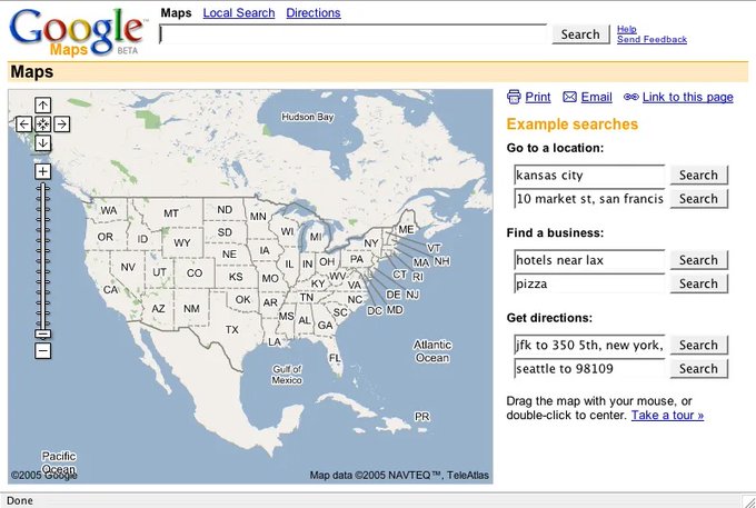
Simplifying Web3 UX + AI Design. Design Partner @electriccapital . Alum of @GoogleMaps , @YouTube , @Facebook . Runner, cyclist, design nerd. Views mine.
Don't wanna be here?
Send us removal request.