Alasdair Rae Profile Banner
Alasdair Rae Profile
Alasdair Rae

@undertheraedar

44,821
Followers
4,521
Following
7,728
Media
25,180
Statuses

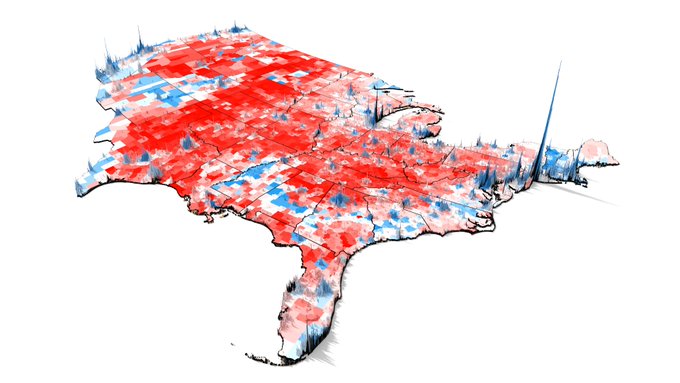
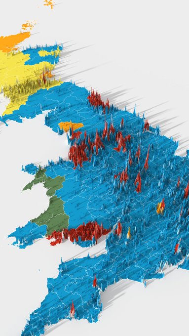
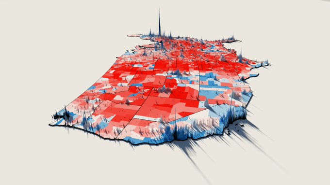
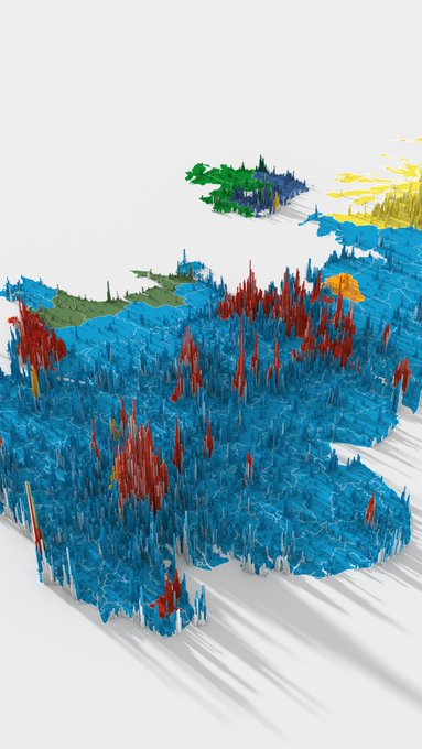
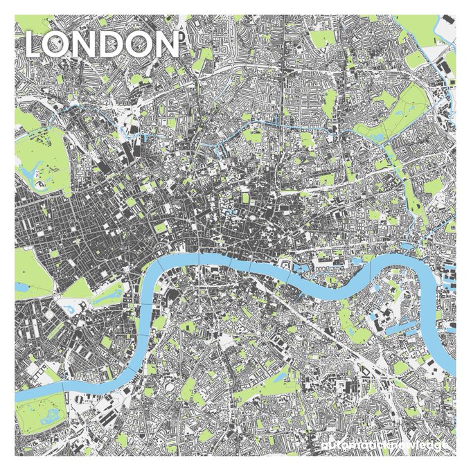
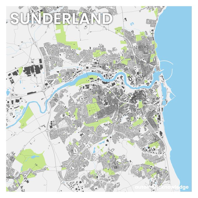
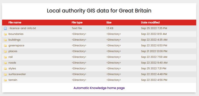
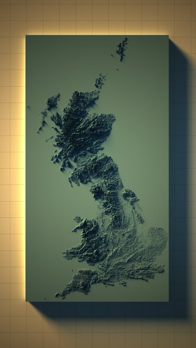
Maps, stats, data, cities, density, elections, gifs, geo + QGIS training with Map Academy - founder of Automatic Knowledge

Sheffield, England
Joined July 2011
Don't wanna be here? Send us removal request.
@undertheraedar
Alasdair Rae
3 years
Here's the final version of the global population density graphic I made, because another one that is circulating was less well defined, and someone cropped NZ off it
Tweet media one
349
6K
28K
@undertheraedar
Alasdair Rae
4 years
I decided to create a few more European population density renders - you can find more here if you need a break from the doomscrolling:
Tweet media one
Tweet media two
180
2K
6K
@undertheraedar
Alasdair Rae
1 year
Today's map is the final revision of my attempt to split the population of the UK into four roughly equal parts using a big grid and then designate capital cities that nobody would have a problem with 😉
Tweet media one
468
449
6K
@undertheraedar
Alasdair Rae
4 months
🥳 @WillDeakin1 has now done a passenger flow map for every station in Britain - all 2,657 of them - you can find them here:
Tweet media one
Tweet media two
Tweet media three
Tweet media four
108
491
4K
@undertheraedar
Alasdair Rae
1 year
Okay, some European population density stuff now - starting with the top 100 1km grid squares by population across Europe, based on the most recent Eurostat data - more to follow
56
722
4K
@undertheraedar
Alasdair Rae
1 year
Today's census map shows the most common housing tenure in each local authority in England and Wales 🏡
Tweet media one
127
534
3K
@undertheraedar
Alasdair Rae
4 years
How big is the 90 minute public transit commuter zone for London vs San Francisco? This is my attempt to answer the question. Arrival point is central London or downtown SF. So, light areas = you ought to be able to reach central London/downtown SF within 90 minutes.
Tweet media one
118
829
3K
@undertheraedar
Alasdair Rae
4 years
I'm getting ready to go back to the West Highlands next week so I thought I'd make a 'will it be raining when I'm in the West Highlands, and will I be able to see Ben Nevis this time, and also do I need my waterproofs?' map
Tweet media one
86
471
2K
@undertheraedar
Alasdair Rae
10 months
I always wondered what a population density spike map + political map would look like so I had a go at it (in new version of #aerialod ) and my verdict is: slightly mad, but quite interesting
Tweet media one
Tweet media two
Tweet media three
Tweet media four
46
243
2K
@undertheraedar
Alasdair Rae
1 year
How far south do you have to go before you get to 50% of England and Wales living north of the line? Figures always give % of England and Wales population above/below the moving line. (reposting this for anyone who wants to avoid work and learn some essential demography trivia)
42
222
1K
@undertheraedar
Alasdair Rae
4 years
a few of Japan now - definitely one of the most interesting countries in relation to population distribution and density
Tweet media one
Tweet media two
Tweet media three
14
453
1K
@undertheraedar
Alasdair Rae
6 years
Marine traffic around the UK, in maps. Just a bit of summer blog fun, but actually quite interesting. Loads more maps here, including zoomed-in versions:
Tweet media one
Tweet media two
Tweet media three
Tweet media four
42
483
1K
@undertheraedar
Alasdair Rae
4 years
and, finally, here's a population density render of the entire world - zoom in, or open the image in another tab/window to see the fine detail here - it comes out quite well even at this scale (this escalated slowly, but I got there in the end🌍)
Tweet media one
33
352
1K
@undertheraedar
Alasdair Rae
1 year
Fairly new set of global roads data from Microsoft: 47.8 million km of roads for a huge chunk of the world (note format is tsv) "The data is freely available for download and use under the Open Data Commons Open Database License (ODbL)." #opendata
Tweet media one
12
218
1K
@undertheraedar
Alasdair Rae
1 year
The longest straight line in Great Britain (without crossing a public road). Something I've been meaning to investigate for a while - and I get a longer line than the Ordnance Survey one:
Tweet media one
34
98
1K
@undertheraedar
Alasdair Rae
9 months
Today's map is all land over 300m in 3D, everything else flat - using Ordnance Survey terrain data, and now I'm googling "highest point in Gloucestershire" to find out what that dot is
Tweet media one
Tweet media two
Tweet media three
Tweet media four
44
121
1K
@undertheraedar
Alasdair Rae
1 year
My adventures in population density continue - this time I try to find the maximum population density in the United States, using 2020 Census data - e.g. here's the maximum 1km square I found in each state long read here:
28
110
989
@undertheraedar
Alasdair Rae
1 year
My adventures in 2021 England and Wales Census data continue into 2023, this time with a look at modal age by local authority and which 'generation' each area fits into (colours and inspiration from @jburnmurdoch here)
Tweet media one
24
179
967
@undertheraedar
Alasdair Rae
4 years
and, as a little experiment, I did one with just spikes - no land. I think this makes it easier to see some places - e.g. check out New Zealand or Hawaii, or even Reykjavík if you look closely.
Tweet media one
50
252
935
@undertheraedar
Alasdair Rae
1 year
trying to make sense of the bigness of the Elizabeth Line so obviously had to move it north and make some maps (using correct geodesic transformation to account for shifting it northwards, obvs)
Tweet media one
Tweet media two
Tweet media three
32
268
912
@undertheraedar
Alasdair Rae
5 years
My 5 year old son made a quiz for us. It's pretty tough.
Tweet media one
48
88
889
@undertheraedar
Alasdair Rae
4 years
some renders of North American population density now - I think my favourite view here is around the Midwest and Great Lakes
Tweet media one
Tweet media two
Tweet media three
Tweet media four
23
250
881
@undertheraedar
Alasdair Rae
5 years
A UK-wide version of that 'constituency by deprivation' chart. All 650 constituencies, with names. Wanted to see what it looked like, so here it is. Giant version: Notes on the image have source and method. More info here:
Tweet media one
41
523
837
@undertheraedar
Alasdair Rae
2 years
Thanks to @willy_maps idea and code, and a bit of help from @en_dash , I have now made a totally essential spidermap of trig pillars across Great Britain - shows the 8 closest trig pillars to the centre of the screen
45
154
837
@undertheraedar
Alasdair Rae
1 year
I'll maybe do a European population density megathread soon because I've finished lots of new maps, but in the meantime here are the locations of the top 40 most densely populated square kilometres
Tweet media one
Tweet media two
27
148
823
@undertheraedar
Alasdair Rae
1 year
Another very interesting recent England and Wales Census 2021 release is the passport data, so here's a map of % with no passport at MSOA level, will add a couple more below
Tweet media one
25
176
825
@undertheraedar
Alasdair Rae
5 years
English constituencies by winning party in 2017, and level of deprivation on 2019 IMD (update of a similar chart I did in 2015) Data: and [corrected version of earlier tweet]
Tweet media one
42
403
786
@undertheraedar
Alasdair Rae
2 years
Map of the day today is all areas of Great Britain within / not within 10 miles of a railway station, and is Berwick the only lonely circle?
Tweet media one
Tweet media two
Tweet media three
44
163
777
@undertheraedar
Alasdair Rae
3 years
While I'm waiting for the next round of election results, I decided to update my UK-wide 'deprivation/constituency' chart using new data. It's up to date following the Hartlepool result, and has constituency names on the graphic this time.
Tweet media one
15
253
766
@undertheraedar
Alasdair Rae
3 years
this is the little 'About this print' sheet that goes along with it
Tweet media one
4
84
695
@undertheraedar
Alasdair Rae
1 year
A little data nugget from this week's (very unusual but still useful and interesting) travel to work data, using LSOAs -map on left is areas where 25% or more worked from home in 2011 -map on right is the 2021 version let's wait 10 years and see what happened next
Tweet media one
Tweet media two
23
186
670
@undertheraedar
Alasdair Rae
3 years
I've now done a full write up on the 'arterial cities' visuals I've been spamming everyone with: includes 50 British towns and cities, the raw files, plus how to make them
Tweet media one
Tweet media two
Tweet media three
25
87
625
@undertheraedar
Alasdair Rae
2 years
Trying to make 'Inverness is west of Plymouth' the new 'Bristol is east of Edinburgh', although there are lots to choose from and even though I've checked my map maths I still think some of these can't be right
Tweet media one
59
119
588
@undertheraedar
Alasdair Rae
1 year
I found 140 1km grid squares with more than 30,000 people - this is where they are - distributed quite widely across Spain, with all the French ones in Paris and a few elsewhere - but 89 of them are in Spain
Tweet media one
Tweet media two
Tweet media three
12
171
588
@undertheraedar
Alasdair Rae
1 year
Today's #30DayMapChallenge theme is "My favourite..." and for some reason I really enjoy exploring elevation data like this to see what the world looks like - plus also check out Spain 👀 (this is an update of a previous map - prize if anyone can guess the elevation cutoff)
Tweet media one
41
59
573
@undertheraedar
Alasdair Rae
7 years
Yes, you do want all of Great Britain's buildings in a massive shapefile set:
Tweet media one
Tweet media two
Tweet media three
19
213
571
@undertheraedar
Alasdair Rae
2 years
Always wondered when I would get the chance to use this bad geography joke
Tweet media one
Tweet media two
11
69
561
@undertheraedar
Alasdair Rae
2 years
I thought it was important, in the spirit of internet mapping and high quality data science, to also do this for Greggs locations - so this one shows the 10 closest Greggs across the UK
37
155
556
@undertheraedar
Alasdair Rae
1 year
More Census age data today - a little animation of % by single year of age in each local authority. Probably needs a few watches to sink in - lots in here - but the final 10 seconds I find quite sombre, and you'll NEVER guess when lots of people leave home
20
93
525
@undertheraedar
Alasdair Rae
1 year
With the latest version of qgis2threejs in QGIS you can set your 3D scenes to autoplay in the browser, following any path you like (as you can see I need to work on this!) - here's the live web page example shown in the video #QGIS
2
76
513
@undertheraedar
Alasdair Rae
1 year
More England and Wales Census data came out this week - health this time - so I took a look at the geography of bad/very bad health (and then overlaid coalfield areas for comparison)
15
121
508
@undertheraedar
Alasdair Rae
1 year
More map stuff from the Highlands, this time showing the current 42 mile / 1h15m detour to reach Corran because the ferry is broken (500 metres across the Loch, usually) - having a massive impact on journeys west for foreseeable future
46
142
510
@undertheraedar
Alasdair Rae
4 years
New blog post: 'How to make a 3D population density render for any country in the world' - step-by-step guide, using open data and free software - I also share example files you can use straight away - replicate the image below for any country
Tweet media one
16
97
486
@undertheraedar
Alasdair Rae
4 years
I haven't really got very far with other parts of the world but here's a fairly basic version for the lower 48 in the US, in roughly the same style as the European ones
Tweet media one
10
103
475
@undertheraedar
Alasdair Rae
1 year
Where's the most densely populated square km in the UK, how many people live in it, and what does it look like on the ground? My attempt to answer these questions, in a bit of a long read, with loads of maps:
Tweet media one
Tweet media two
Tweet media three
23
74
487
@undertheraedar
Alasdair Rae
1 year
All A roads and motorways in Great Britain, in order, for today's #30DayMapChallenge remix finale 🎶 My favourite (but also nemesis) is the A9 but I'm also quite fond of the A66, A82, and the A858, if we're sharing our deepest secrets - yeah the A830 isn't too bad either!
24
93
481
@undertheraedar
Alasdair Rae
2 years
A little map animated map experiment with Ordnance Survey data - contours are animated at 10 metre intervals, starting at 10 metres above sea level
13
113
478
@undertheraedar
Alasdair Rae
4 years
I got slightly distracted whilst doing some more sensible population density analysis and this happened - a map and two charts of the UK's population, by 1km grid cell (excuse the slight misalignment on the charts but I was on a deadline for something else)
Tweet media one
22
101
466
@undertheraedar
Alasdair Rae
1 year
May the Forth be with you this year (tweeting three Forth bridges on the fourth day of the fifth month is now traditional)
Tweet media one
10
87
459
@undertheraedar
Alasdair Rae
3 years
Ordnance Survey open data + QGIS, with a circular clip/fade in the print layout and you get some fancy, same-scale city footprint graphics, if you're into that kind of thing
Tweet media one
Tweet media two
Tweet media three
20
60
453
@undertheraedar
Alasdair Rae
1 year
From a long list of unfinished blog posts - my attempt to calculate the population of Great Britain by altitude (pub quizzers unite)
Tweet media one
Tweet media two
28
58
448
@undertheraedar
Alasdair Rae
4 years
I've had quite a few queries about population density stuff I've done in the past - so this is a very short thread about that (and not beyond that because I am mindful of where my knowledge ends, I hope!)
Tweet media one
14
91
445
@undertheraedar
Alasdair Rae
1 month
I saw this Met Office 'UK climate districts map' online so naturally I decided to try and figure out the population of each area whilst eating my lunch and these are the incredibly interesting results
Tweet media one
Tweet media two
12
28
444
@undertheraedar
Alasdair Rae
5 years
A little bit of map fun. Population of the world, one degree of latitude at a time:
7
167
427
@undertheraedar
Alasdair Rae
5 years
Brexcuse me but I mapped that ward-level Brexit data, only a couple of years after it was made available. Some very interesting local patterns - more here:
Tweet media one
Tweet media two
Tweet media three
Tweet media four
20
139
433
@undertheraedar
Alasdair Rae
4 years
If it wasn't for Spain's Meseta Central (or the title on the image, admittedly) it wouldn't be so easy to tell what this is - and this also goes some way to explaining those earlier European population density maps I posted.
Tweet media one
16
103
422
@undertheraedar
Alasdair Rae
4 years
🗞️After 4,320 days and 190,020 emails, I'm moving on from the University of Sheffield, so I've written a short blog post about what's next (tl;dr see the new web link in my twitter bio) - I shall continue to post stats, maps and other stuff here 🗞️
94
24
421
@undertheraedar
Alasdair Rae
4 years
An updated constituency/deprivation chart for England for the 2019 general election - looks quite different to before. See following tweets for comparison with 2017 and 2001 #ge2019 #ge2019data
Tweet media one
14
281
414
@undertheraedar
Alasdair Rae
5 years
When I did the deprivation by constituency by party colour chart, I then wondered what other elections would look like, so here's the 2017 election vs 2001 election, for England
Tweet media one
25
138
412
@undertheraedar
Alasdair Rae
3 years
and, should you have a burning question like 'how can I make one of these?' or 'where do I get the data?' then see my blog for all the answers
6
28
404
@undertheraedar
Alasdair Rae
5 years
My maps and stats for the English Indices of Deprivation 2019 are now online – all 317 local authorities here: (with links to @mhclg data and docs) – short thread with some highlights to follow
19
283
407
@undertheraedar
Alasdair Rae
3 years
More 10km x 10km city squares, this time a simple blue-green-grey approach to displaying the urban fabric, including parks and water - Edinburgh is of course very parky so is a good example
Tweet media one
Tweet media two
Tweet media three
26
52
406
@undertheraedar
Alasdair Rae
5 years
With recent release of QGIS 3.8 you can now export image sequences from the 3D viewer and patch them together as animations (using an external tool - I used ffmpeg for this) Here's a little tour of Ben Nevis in Scotland - 'tourist path', Carn Mor Dearg arête, Allt a' Mhuillin
7
106
391
@undertheraedar
Alasdair Rae
2 years
🚨Big new batch of local GIS open data resources 🚨 for Great Britain - based on OS and ONS open data - a shortish thread (data for all local authorities individually, as well as full Great Britain files, all in one place - see screenshot at link below)
Tweet media one
Tweet media two
Tweet media three
11
70
376
@undertheraedar
Alasdair Rae
4 years
Australia joins the gang too now, even though it's so big it almost broke my computer. Nice though that the 1km population data picks out some quite small, isolated settlements.
Tweet media one
11
74
371
@undertheraedar
Alasdair Rae
1 year
I'm working on my spelling of mortgage, probably due to the shock of seeing how many households own without a mortgage!
18
6
363
@undertheraedar
Alasdair Rae
4 years
the view from the east over the Baltic Sea, with St. Petersburg in the borttom left and and a good chunk of Finland in the middle of the image. The UK and Ireland are in the distance here. I find this particular view very interesting.
Tweet media one
10
42
364
@undertheraedar
Alasdair Rae
3 years
Thanks to @cartocalypse 's very clever method I have now figured out how to create a very simple population density profile line in QGIS and it looks like this for a chunk of England using 1km data (and a little bit of Wales)
9
53
361
@undertheraedar
Alasdair Rae
4 years
now where was I? Oh yes, here's a view that includes Cairo, Istanbul, Tbilisi, Baku, Tehran, Baghdad and lots of other interesting places.
Tweet media one
5
64
347
@undertheraedar
Alasdair Rae
1 year
A short Glasgow Subway thread, starting with a little animated map of the 10.5km / 6.5 mile route, which opened in December 1896
12
46
352
@undertheraedar
Alasdair Rae
3 years
A little bit of weekend map therapy, with a relief map of Scotland - simple, darkened tones and a bit of snow on the hills
Tweet media one
23
31
339
@undertheraedar
Alasdair Rae
3 years
A very simple plot of those areas in England among the 1% MOST deprived (blue 🟦), and 1% LEAST deprived (orange 🟧), according to the 2019 English IMD. The population in blue areas is c. 540,000, orange areas very similar (2020 mid-year estimates) - 10%-10% map in next tweet
Tweet media one
20
117
337
@undertheraedar
Alasdair Rae
6 months
A #30DayMapChallenge world map for today's Oceania theme - kind of reversing a popular internet map meme - you may have to look closely
Tweet media one
21
41
339
@undertheraedar
Alasdair Rae
4 years
I'll post the rest of these later on, but for now here's a closer view of the Philippines (I may turn all these into a book, who knows)
Tweet media one
9
74
320
@undertheraedar
Alasdair Rae
1 year
The longest line, part 2 - an exhaustive search for the longest straight line route in the UK, without crossing any public roads (same location as before but a bit longer) - includes a note on methods
19
21
324
@undertheraedar
Alasdair Rae
4 years
New York City is somewhat exceptional so here's a slightly ridiculous close up looking down the eastern seaboard (I'll stop this now but may continue - we'll see)
Tweet media one
11
45
317
@undertheraedar
Alasdair Rae
2 years
Short map thread on geography of jobs across Great Britain, by sector, at local authority level. Coloured areas show where at least 1 in 10 jobs are in a particular industry (data: BRES 2020, ONS) - top areas are labelled
Tweet media one
Tweet media two
Tweet media three
Tweet media four
14
81
326
@undertheraedar
Alasdair Rae
11 months
110 QGIS videos and one bad shirt on the channel now, including: - how to get data from that web map - summing populations by area - change map opacity by population value - blend text with map in print layout - calculate area overlap % - glowing lines
Tweet media one
10
69
323
@undertheraedar
Alasdair Rae
4 years
the final batch of these population density maps (for now) focuses on India and its neighbours, from different perspectives - with the final one offering a closer look at Sri Lanka
Tweet media one
Tweet media two
Tweet media three
Tweet media four
8
85
308
@undertheraedar
Alasdair Rae
2 years
Brand new intermediate QGIS course just launched on @udemy after 6 months of planning and filming! Wooooo - almost 100 videos Non-profits, charities etc message me for free access #QGIS
Tweet media one
14
59
302
@undertheraedar
Alasdair Rae
4 years
This is a map showing all land over 2,000ft in Scotland just because @VictimOfMaths asked for it and because we need to know 'what's the longest distance you can walk above 2,000ft in the UK?' and suchlike
Tweet media one
17
66
303
@undertheraedar
Alasdair Rae
3 years
Exciting day tomorrow as the lovely swisstopo people open up their terrain data "Permission is no longer required for the use of most digital products such as national maps, orthophotos or geological vector data." (this includes commercial use)
Tweet media one
Tweet media two
6
73
302
@undertheraedar
Alasdair Rae
2 years
My new online intro-level QGIS course is now live on Udemy, for anyone who wants to get into mapping - or knows anyone that does - see short thread below with further details
15
56
296
@undertheraedar
Alasdair Rae
3 years
Let's see how many different types of housing I can squeeze into one view
Tweet media one
15
14
295
@undertheraedar
Alasdair Rae
6 months
Migration data from the 2021 census (lines connect current home with home one year previous) - always shows up some interesting ones, but 100 points to anyone who instantly knows what the long distance lines are (I'll share the geodata later on)
Tweet media one
Tweet media two
Tweet media three
Tweet media four
21
37
297
@undertheraedar
Alasdair Rae
1 year
@MarkThackstone okay, you are now Minister for Location in the new Government of Bangoria, well done
3
1
293
@undertheraedar
Alasdair Rae
4 years
I've been experimenting with simple ways of displaying data recently, plus looking at historic data on Gaelic, so here's a simple map showing the % of people in each 1981 enumeration district who were Gaelic speakers - showing only the numbers, roughly coloured by value
Tweet media one
26
69
289
@undertheraedar
Alasdair Rae
1 year
the people have demanded a London and south east zoom, so the people will have it
Tweet media one
29
4
282
@undertheraedar
Alasdair Rae
2 years
A little look at high/low modal age across UK local authorities - some basic observations - cities and university towns - coastal - modal age of 73 very common! (idea after @resi_analyst idea of doing this for modal housing type last week)
Tweet media one
18
82
282
@undertheraedar
Alasdair Rae
4 years
Some #QGIS and other tutorials that I've put together, if anyone needs ready-made material: QGIS Atlas by field - 3D interactives in QGIS 3D rendering with #aerialod Kepler -
11
86
279
@undertheraedar
Alasdair Rae
3 years
A little look at the areas in England and Wales where the median house price is at least 10 times the median annual salary
Tweet media one
16
103
281
@undertheraedar
Alasdair Rae
1 year
100 years of the road numbering system in the UK 🥳
Tweet media one
11
38
280
@undertheraedar
Alasdair Rae
7 years
21 years of local house prices in a single gif? Why not. Designed to be watched on loop; look closely at 2008 and beyond. #housing #dataviz
16
349
265
@undertheraedar
Alasdair Rae
5 years
Comparing historic and contemporary development with maps has never been easier, thanks to @natlibscotmaps - you can view side-by-side or use the very cool swipe feature (this is OS 1888-1913 series vs modern satellite view)
11
111
277
@undertheraedar
Alasdair Rae
7 years
I'm writing a longer blog on geogiffery but it won't be ready for a while so in the meantime here are the countries of the world in a geogif
9
133
267
@undertheraedar
Alasdair Rae
4 years
Population chunks of South America - small contribution to #30DayMapChallenge from me - a bit of population data + Aerialod, with a bit of text
Tweet media one
5
64
268
@undertheraedar
Alasdair Rae
4 years
I ran off a few of these for New Zealand overnight, because 'maps without New Zealand' is not part of my modus operandi (a bit rough round the edges perhaps, but they look about right to me) cc @iain_white
Tweet media one
Tweet media two
Tweet media three
8
44
269
@undertheraedar
Alasdair Rae
6 years
Okay, one more geogif, just because it's Friday - this time population density across Europe, using 1km grid data #dataviz #geogif (source: )
9
188
265
@undertheraedar
Alasdair Rae
8 months
More land area calculations today, golf courses of Greater London this time. Guess what % of Greater London is golf course? (source is latest OS Open Greenspace file, includes a few driving ranges)
Tweet media one
23
49
270
@undertheraedar
Alasdair Rae
1 year
Map of the day: Leeds is 61% green belt - plus link to maps for every other local authority
Tweet media one
Tweet media two
Tweet media three
9
53
266