
[taps sign]

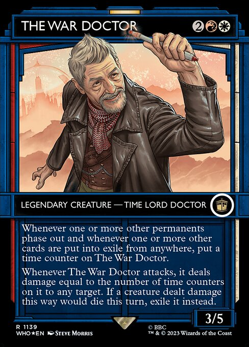
there has been a concerning trend lately where cards are being printed in frames that make it not immediately clear what color the cards are, and i hope that wotc can find a better way to walk that line. i think alt frames are by and large cool, but it adds a lot of memory load
97
50
1K
12
69
820
Replies
Side note, I think it's the best article I've written.
3
0
61

@emmadpartlow
i can still remember a lot of the player base being upset about the 8th edition card-frame change. ironically (in retrospect), the reason given was that it made the cards more readable.
3
0
31

@emmadpartlow
Wotc needs to be more confident in MtG’s style and imagery. Having some different frame styles and stuff is cool, but it’s gotten to the point where the main way they market cards is by how much they don’t look like MtG cards.
1
0
11

@emmadpartlow
I have said before to friends that Hasbro doesn't want to sell a game, they want to sell collectible stamps, the game is just an excuse to justify the price of said stamps.
This keeps being more true with each set.
0
1
9

@Kesswylie
I got those two wolves. One is howling for consistent, accessible, and minimalistic design. Then the other is incoherently snarling about flavor, artistic freedom, and skeuomorphism.
0
1
4
0
0
7


@emmadpartlow
Hey I get the notion but can we maybe make the collectible ones legible? You know, for old, blind people like me?
0
0
0

@emmadpartlow
It cares more about collectability than literally anything else in the "game". It's been happening for years now, each rare card they release has 10 variants, and 9 out of them are only available in premium products. Forget about forced inclusion, forced scarcity is the real evil
0
0
0

@emmadpartlow
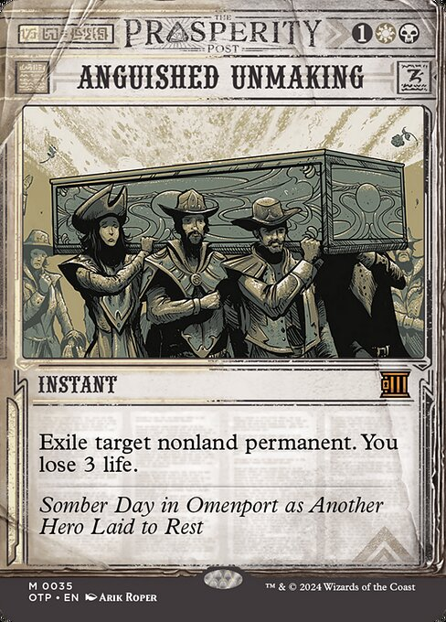
I don't know if it's funny or sad or both that the Double Feature showcase treatment, despite every other problem with it, still has more readable colour identity than some of the stuff that's come out since. MKM's case files were a definite low point and OTP isn't much better.
1
1
5


@emmadpartlow
I have never once used a frame to judge what color a card is. It's written in a little circle in the corner of the card. Is that common?
0
0
1