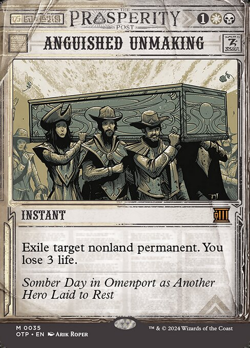
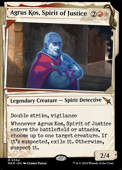
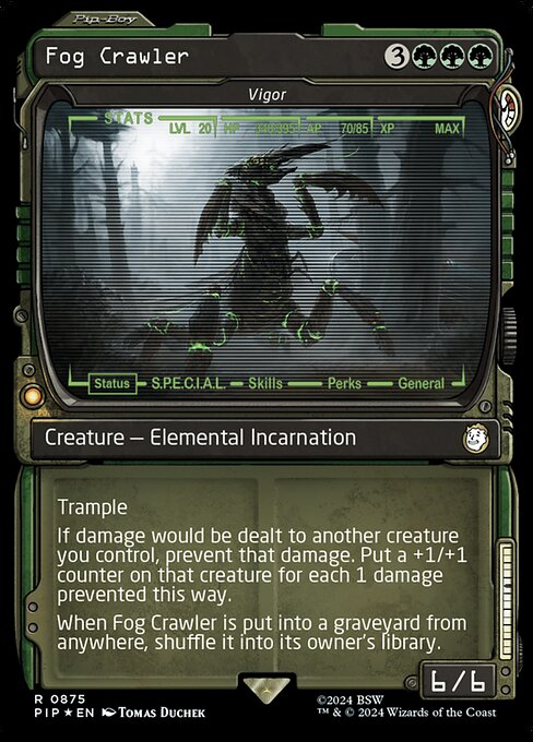
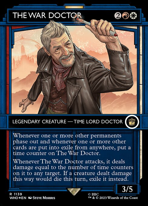
there has been a concerning trend lately where cards are being printed in frames that make it not immediately clear what color the cards are, and i hope that wotc can find a better way to walk that line. i think alt frames are by and large cool, but it adds a lot of memory load
97
50
1K
Replies
@ghirapurigears
This has been going on for years. Well before these frames but they are some of the worst offenders.
2
0
1
@ghirapurigears
These aren’t the normal cards … I.E l. You can find regular versions of said cards
2
0
0
@ghirapurigears
The mana symbols are still printed on the alt frame cards. I understand that the color of a card is a big indicator, but the symbols are still there. Not 100% certain how fine a line they need to walk since the mana symbols give context clues.
6
0
13
@ancientsbane40k
the problem is that some of the symbols don't have color or aren't high enough contrast to notice. i was in a draft with a fallout pack and passed a vigor even though i was mono green because the card just did not register as green
1
0
37
@ghirapurigears
not at all shade but vigor is literally a green shade. the rest of these I agree but that one threw me being included
1
0
0
@_Naga_379_
please trust me that at 2 o'clock on sunday at mc chicago in pack 3 of a weird chaos draft it was not at all obvious, especially in a pack full of weirdo frames like the fallout collector booster
and i have it in front of me and it genuinely looks like a mainly black card.
1
0
11
@ghirapurigears
Throne of Eldraine was their first "booster fun" set and they got it on the first try. Unique frames that show the color of the card & consistent and unique art style w/o monochromatic colors so you could easily identity each card. They should have kept to this.
1
3
119
@ZelosD_FFXIV
i adored these. and the ones in lci, and even the chaotic pile in MoM. it's just when the color is completely replaced that there's a problem
2
0
43
@ghirapurigears
This is a very legit complaint, but you've picked 1 card that demonstrates your point and 3 that show multiple indicators of the card colors.
2
0
17
@spinebustertee
the thing twitter doesn't show is how these cards look in packs when you open them with a host of other cards and how your eyes gloss over the frames, and don't see the mana costs because they're hidden behind other cards
1
1
23
@ghirapurigears
I think the argument is that if the cards are in your hand, or included in your deck, its implied what color it is already by use of them. There were some coloring issues with the set symbols of LCI also. Seems like a lot of rushed layouts to me. I agree with you.
0
0
0
@ghirapurigears
I agree with the war doctor for sure and the the breaking news cards but I think the fallout and murders treatments were decent
0
0
0
@ghirapurigears
Think it's time for me to write another feature about this. I've had the itch. 😅
0
0
24
@ghirapurigears
Really wish they stopped with the EVERY set needs a new frame but Booster fun completely evaporates that idea. I love them doing things like the UB style but man it’s really hard to vouch for the lotr holiday and WHO ones
0
0
2
@ghirapurigears
The war doc one is *really* bad. I genuinely thought it was jeskai cuz of how much blue is on the card.
0
0
0
@ghirapurigears
Too many frames, I’d like to see them return to some of the (better) established ones. I liked how March of the Machines provided an opportunity for this
0
0
0
@ghirapurigears
Some of the more recent secret lairs are egregious in that not only is it not clear what color they are, but they really look like they're a *different color*
1
0
5


