@aaronpenne
Aaron Penne
5 years
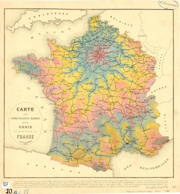
This is my new favorite French #map . Found this one in the University of Chicago map collection. The color choices are not what I expected from a #datavisualization 
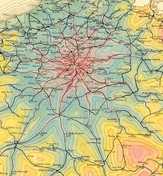
made in 1882, but I'm here for it. This shows the travel times from Paris radiating out into the country.
Tweet media one
Tweet media two
Tweet media three
9
56
267

Replies

@micahstubbs
micah.fyi
5 years
@aaronpenne an isochrone map! here's a modern version from @pkerpedjiev
Tweet media one
1
1
5
@aaronpenne
Aaron Penne
5 years
0
0
1
@AmericanEclipse
Great American Eclipse πŸŒžπŸŒ—πŸŒŽ
5 years
@aaronpenne Wow, stunning map! I made a similar color palette choice for my eclipse drive time map from last year.
Tweet media one
1
3
11
@aaronpenne
Aaron Penne
5 years
@AmericanEclipse I absolutely love this
0
0
1
@AnanceLLC
Anance
5 years
@aaronpenne Gorgeous! May I post it to r/mapporn on Reddit? They would love it.
1
0
1
@aaronpenne
Aaron Penne
5 years
@AnanceLLC It's the internet, do whatever you want!
1
0
1
@f_dion
Francois Dion [email protected]
5 years
@aaronpenne Looked into some of my US Census Statistical Atlases (Gannett era), color scales were more brownish. The pie charts however use a similar palette.
1
0
1
@aaronpenne
Aaron Penne
5 years
@f_dion Do you have hard copies?
1
0
0
@TokenxEffort
Laura Burnett
5 years
@aaronpenne Sorry if I missed this but is each isobar an hour?
1
0
1
@aaronpenne
Aaron Penne
5 years
@TokenxEffort I couldn't find out for sure, but that is a reasonable guess
0
0
0
@micahstubbs
micah.fyi
5 years
@aaronpenne had to translate this one ☺ 
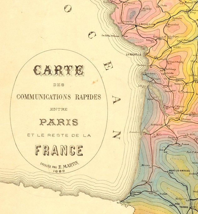
Cartes des communication rapides entre Paris et le reste de la France. Dressée par E Martin 1882
Tweet media one
0
0
2
@sarahbellmaps
Sarah Bell
5 years
0
0
1
@trollball
Marc Jacobs
5 years
@aaronpenne @maartenzam This is beautiful. Also, note how Alsace & Lorraine are shown as separate from Germany. Only 18 years after 1870, so I can see why.
0
0
1
@AtloTeam
atlo.team
5 years
@aaronpenne real gem
0
0
1