Nate Piekos of Blambot Profile Banner
Nate Piekos of Blambot Profile
Nate Piekos of Blambot

@blambot

14,043
Followers
909
Following
8,019
Media
41,877
Statuses

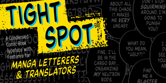
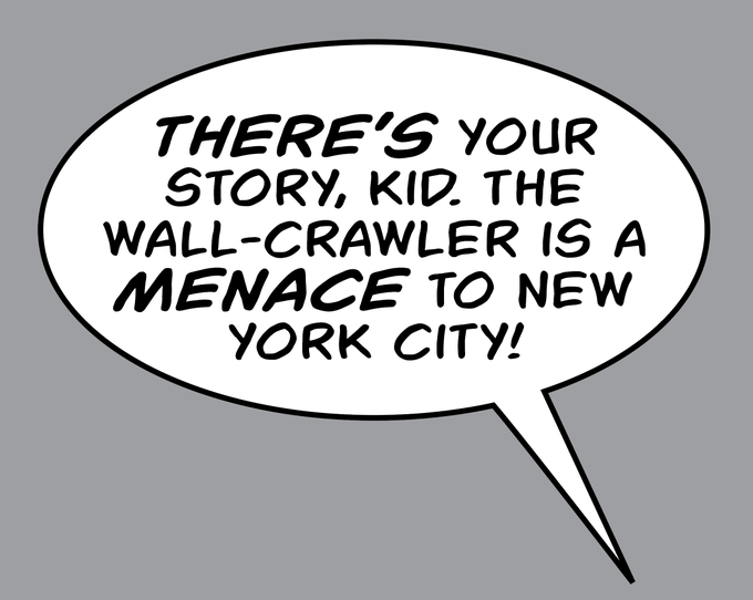
Creator of , award-winning designer, typographer, and Eisner-nominated letterer. Author of The Essential Guide to Comic Book Lettering.

Rhode Island, USA
Joined June 2009
Don't wanna be here? Send us removal request.
Pinned Tweet
@blambot
Nate Piekos of Blambot
6 months
Do you have the most comprehensive guide to modern comic lettering ever written? It's just $14.49 on Amazon, and it's still got 4.8 stars! 256 pages, full color! Written by Nate Piekos, Introduction by Tom Orzechowski, and published by Image! AMAZON:
Tweet media one
3
35
91
@blambot
Nate Piekos of Blambot
3 years
Writers, two separate thoughts = two separate balloons.
Tweet media one
35
4K
30K
@blambot
Nate Piekos of Blambot
1 year
It can't always be helped, but how you stack text in a balloon can influence the readability of the text. Notice how the text reads more naturally when you break lines based on punctuation.
Tweet media one
29
4K
29K
@blambot
Nate Piekos of Blambot
7 years
A cautionary tale. I've been in pain every day for a year...
Tweet media one
118
3K
5K
@blambot
Nate Piekos of Blambot
6 months
A periodic reminder about free-use of Blambot "indie fonts" for small press comic creators...
Tweet media one
32
1K
4K
@blambot
Nate Piekos of Blambot
5 years
Writers and letterers, two separate ideas should be broken into two balloons, particularly when there's a direct address. #lettering #comics
Tweet media one
18
899
4K
@blambot
Nate Piekos of Blambot
2 years
And now you know.
Tweet media one
29
629
3K
@blambot
Nate Piekos of Blambot
2 years
One of a letterer's primary jobs is to make sure the reading order of a page is as clear as possible. We see this panel layout often, and no matter how much negative space is left at the bottom of panel 2, a good letterer is going to try and preserve the reading order.
Tweet media one
12
551
3K
@blambot
Nate Piekos of Blambot
7 years
Blambot’s BETTER LETTERER tips are all collected right here for your convenience: #blambot #lettering #tips #comics
Tweet media one
15
1K
3K
@blambot
Nate Piekos of Blambot
4 years
“If I do a job in 30 minutes, it’s because I spent 10 years learning how to do that in 30 minutes. You owe me for the years, not the minutes.” (Not mine, but this quote sums up how you should charge as a designer pretty succinctly.)
23
563
3K
@blambot
Nate Piekos of Blambot
8 years
Just turned in final lettering for UMBRELLA ACADEMY: HOTEL OBLIVION #1 !
Tweet media one
30
343
2K
@blambot
Nate Piekos of Blambot
6 months
BTW, this is how you ramp up intensity in dialogue with your graphic design mojo: Over the course of this page, a character is losing control panel by panel, shouting the same word over again until there's a crescendo of violence.
Tweet media one
15
295
2K
@blambot
Nate Piekos of Blambot
4 years
It’s time once again to mention that small press comic creators can use Blambot’s indie fonts in their comics, webcomics, and merch, for free. Doesn’t matter if you’re making money with your comic or not. That’s how I support the indie comics community.
35
1K
2K
@blambot
Nate Piekos of Blambot
5 years
If you’re hiring any creative, you’re hiring their years of experience and knowledge of the craft and how it’s done. You are not hiring a marionette to act as a middleman between you and a task with which you have no hands-on experience. Trust the talent to do the job well.
24
506
2K
@blambot
Nate Piekos of Blambot
7 years
BETTER LETTERER #3 : Dynamic Sound Effects. Read more here: #lettering #comics #blambot
Tweet media one
5
814
2K
@blambot
Nate Piekos of Blambot
2 years
A reminder: Blambot’s indie font free usage policy means that as long as you're self/small press publishing, you can use the indie fonts for free. Same goes for any merch associated with your indie comic. This is how I support the indie community and aspiring comic creators.
34
554
2K
@blambot
Nate Piekos of Blambot
7 years
So I’m homogenizing my various lettering tips into a new series called…LETTER BETTER! And here’s #1 :
Tweet media one
27
761
2K
@blambot
Nate Piekos of Blambot
1 year
Hot take: We need to just stop calling them “Comic cons” if the focus isn’t going to be comics.
85
120
1K
@blambot
Nate Piekos of Blambot
3 years
So, we’ll start at the beginning again… Better Letterer #1 – Personal Pronoun “I” in Comics #comics #lettering #blambot #tips Read more:
Tweet media one
32
322
1K
@blambot
Nate Piekos of Blambot
3 years
Here it is, folks. For the last year and a half I’ve secretly been writing a 200-page book on digital comic book lettering. It’s being published by @ImageComics in October.
Tweet media one
90
369
1K
@blambot
Nate Piekos of Blambot
3 years
Comic lettering is not a repetitive factory assembly line. It is not placing a widget in a hole. It’s not done BY a computer...it’s done WITH a computer. By a designer. With their hands. Lettering is *graphic design.*
23
238
1K
@blambot
Nate Piekos of Blambot
2 years
Reminder: Blambot indie fonts can be used license-free by all indie comic book creators. No matter how much money you’re making, as long as you’re *small press or independent* you can use the indie fonts In your comics, merch, and promotion…(cont)
8
356
1K
@blambot
Nate Piekos of Blambot
4 years
It’s time once again to mention that small press comic creators can use Blambot’s indie fonts in their comics, webcomics, and merch, for free. Doesn’t matter if you’re making money with your comic or not. That’s how I support the indie comics community.
21
543
1K
@blambot
Nate Piekos of Blambot
4 years
Can you hear the difference? This is just one small way that the letterer's design decisions can affect the reader's experience. #comics #lettering #design
Tweet media one
Tweet media two
Tweet media three
15
313
1K
@blambot
Nate Piekos of Blambot
10 years
Properly Stacking Text in a Dialogue Balloon #lettering #comics http://t.co/hYofogkQTy
Tweet media one
22
445
1K
@blambot
Nate Piekos of Blambot
2 years
When I quit my day job at 28 to make the leap into comics full time, the president of the company told me I’d never make it. That I didn’t have the temperament to be a freelancer…that I’d be back. I’m 46 and still self-employed. Don’t listen to those shitheels.
20
66
1K
@blambot
Nate Piekos of Blambot
2 years
Let’s do this again, because I’m frustrated. Standard US Comic book dimensions at print size.
Tweet media one
10
235
949
@blambot
Nate Piekos of Blambot
2 months
Todd Klein's The Art and History of Lettering Comics is now online...for FREE! Each section is expandable via a link!
Tweet media one
8
364
943
@blambot
Nate Piekos of Blambot
6 years
An oldie but goodie from 2014: Fonts are a starting point for sound effects...
Tweet media one
5
277
889
@blambot
Nate Piekos of Blambot
6 years
No matter the size of the balloon, the width of your tails, where they meet the balloon, should be consistent—and here’s my “secret” recipe: I try to make the tail width the same size as the bold characters of the font I’m using. #comics #lettering
Tweet media one
28
222
886
@blambot
Nate Piekos of Blambot
8 years
Updates on @gerardway ’s custom fonts complete! #UMBRELLAACADEMY
Tweet media one
13
216
839
@blambot
Nate Piekos of Blambot
3 years
Sad to hear that Bruce Blackburn, designer of the NASA “worm” logo has died. One of the greatest logos of modern times. It inspired so much futuristic, and then retro-futuristic typography. I mean, how many times have we leaned on that “A” with no crossbar to imply “sci-fi”?
Tweet media one
6
209
831
@blambot
Nate Piekos of Blambot
1 year
You ever read a comic and notice how many of the sound FX are yellow? That's because the letterer never got to see the finished colored art. They were lettering over inks. We use yellow because it's the safest bet to show up against whatever the page's color palette might be.
8
88
830
@blambot
Nate Piekos of Blambot
5 years
BETTER LETTERER #1 : Serif-I vs. Slash-I, the #1 telltale sign of amateur lettering. #lettering #comics #blambot
Tweet media one
15
217
788
@blambot
Nate Piekos of Blambot
6 years
Here’s my “tight 13” essentials of comics lettering. #comics #lettering #blambot
Tweet media one
4
278
772
@blambot
Nate Piekos of Blambot
2 years
Quick tip: One of a letterer's primary jobs is to make sure the reading order of a page is as clear as possible. We see this panel layout often, and no matter how much negative space is left at the bottom of panel 2, a good letterer is going to try and preserve the reading order.
Tweet media one
8
167
765
@blambot
Nate Piekos of Blambot
6 years
If you’re killing yourself doing rush jobs at low rates, you’re not getting your foot in the door for a more comfortable career in the future, you’re helping to normalize low rates/rush jobs in everyone's future…that includes you.
6
280
727
@blambot
Nate Piekos of Blambot
2 years
Exhibit being installed! Jan 20-Feb 10 at Salve Regina University!
Tweet media one
24
48
730
@blambot
Nate Piekos of Blambot
1 year
Tweet media one
8
212
727
@blambot
Nate Piekos of Blambot
3 years
Everyone working with art in the western comics industry needs to commit these measurements to memory... Standard American print dimensions for comic art are: FULL BLEED: 6.875” x 10.4375” TRIM: 6.625” x 10.1875” SAFE AREA: 6.125” x 9.6875”
21
214
725
@blambot
Nate Piekos of Blambot
1 year
If you work in American comics, and specifically if you're an editor, artist, letterer, colorist, or production person, these dimensions should be committed to memory. *This is part of your job.* Properly sized art makes everyone's life easier throughout the creation process
Tweet media one
10
166
664
@blambot
Nate Piekos of Blambot
5 years
Original hand lettering by Todd Klein, in the Blambot studio.
Tweet media one
Tweet media two
Tweet media three
Tweet media four
17
91
602
@blambot
Nate Piekos of Blambot
6 years
FYI: Indie/small press comic creators can use Blambot free fonts LICENSE FREE in their print or webcomics, whether or not they’re making money on their project, and can even be used on merch related to their comics: #blambot #fonts #free
19
294
604
@blambot
Nate Piekos of Blambot
5 years
Have you heard about the new features I'm including in new Blambot pro dialogue fonts? How about SIX versions of every letter...! #lettering #comics #blambot
Tweet media one
18
159
584
@blambot
Nate Piekos of Blambot
5 years
Artists, this panel layout in the middle of a page makes reading order confusing. Don’t expect a good letterer to put balloon 5 here. No one’s going to go from 4 to 5. They’re going to go from 2 to 5. (Cont.)
Tweet media one
12
188
576
@blambot
Nate Piekos of Blambot
6 months
I can't give you candy this Halloween, but how about an updated look at my default lettering template in Illustrator?
Tweet media one
Tweet media two
Tweet media three
Tweet media four
27
79
584
@blambot
Nate Piekos of Blambot
5 years
I ordered a 20’ ladder 3 weeks ago. It’s lost in the mail. A 20’ ladder. Is lost. In the mail.
19
57
547
@blambot
Nate Piekos of Blambot
5 years
Balloon tail widths, where they meet the balloon, should always be consistent. Here's how I do that: When I add tails (pic 1), I make sure the "fat end," where it touches the balloon, is about the same width as the letter-height of my dialogue font (pics 2&3). #lettering #comics
Tweet media one
Tweet media two
Tweet media three
7
114
515
@blambot
Nate Piekos of Blambot
8 years
Yeah, it’s time for this lesson again… #comicbook #lettering #basics
Tweet media one
21
240
500
@blambot
Nate Piekos of Blambot
9 years
Properly Stacking Text in a Dialogue Balloon seems to be getting some RTs today. Here it is in a larger format. http://t.co/JOv6Vt40xa
Tweet media one
16
301
467
@blambot
Nate Piekos of Blambot
8 years
Letterer @deronbennett devised a new way to denote foreign languages. (Image sourced from: )
Tweet media one
21
251
473
@blambot
Nate Piekos of Blambot
8 months
I am lucky enough to work with editors who respect this, but this is the biggest complaint among letterers. Endless revisions chip away at the value of our page rate. Changes are not made with "the push of a button." Letterers are not unskilled labor. We are graphic designers.
Tweet media one
8
119
468
@blambot
Nate Piekos of Blambot
5 years
BETTER LETTERER #4 : Don’t Cross Balloon Tails…Ever! #lettering #comics #blambot
Tweet media one
5
145
447
@blambot
Nate Piekos of Blambot
4 years
Can’t believe it! I won the 2020 @ringoawards for Best Letterer! I’m honored, thank you! It was such a talented lineup of nominees, I never thought I even had a shot.
Tweet media one
69
14
450
@blambot
Nate Piekos of Blambot
3 years
American comic book dimensions at print size. Learn it. Live it. Love it.
Tweet media one
6
90
417
@blambot
Nate Piekos of Blambot
7 years
BETTER LETTERER #5 : "Stacking Text in Dialogue Balloons” Read more here: #lettering #comics #blambot
Tweet media one
7
175
403
@blambot
Nate Piekos of Blambot
2 years
Happy Letterer Appreciation Day!
Tweet media one
9
176
406
@blambot
Nate Piekos of Blambot
8 months
Happy Letterer Appreciation Day!
Tweet media one
10
170
406
@blambot
Nate Piekos of Blambot
3 years
Here is your first look at interior pages from my Essential Guide to Comic Book Lettering! A 256-page deep-dive into lettering! Arriving in Oct. from Image Comics. Foreword by Tom Orzechowski! Pre-order on Amazon, or wherever you get books.
Tweet media one
Tweet media two
Tweet media three
Tweet media four
19
113
394
@blambot
Nate Piekos of Blambot
3 years
My default lettering template as of Jan 2021. This is where I keep ALL the assets I’ve designed over the years. When I start a new project, I delete whatever I don’t need, and re-save the blank template for that project’s style guide. #lettering #comics #Illustrator
Tweet media one
15
49
391
@blambot
Nate Piekos of Blambot
10 months
Graphic design pet peeve: I really, REALLY hate it when a logo is supposed to have organic distress, but you can see the pattern of distress repeat in duplicate letters--usually because someone's using a font with distress built in... Do the extra work and make it all different!
Tweet media one
6
50
385
@blambot
Nate Piekos of Blambot
6 years
I’m reading about the Japanese concept of Ikigai this morning. I think this could be useful for us creative types…or for anyone really. Interesting.
Tweet media one
5
129
377
@blambot
Nate Piekos of Blambot
7 years
Blambot’s BETTER LETTERER #2 : Kerning! #typography #lettering #comics #blambot
Tweet media one
4
167
379
@blambot
Nate Piekos of Blambot
3 years
So unless I decide to change anything, here’s my entire cover spread--including spine--for The Essential Guide to Comic Book Lettering.
Tweet media one
12
51
371
@blambot
Nate Piekos of Blambot
4 years
I never get tired of replying to emails by indie/small press comic creators asking how much they need to pay to use a Blambot indie font in their comic... The answer is nothing. I gotcha covered:
21
124
349
@blambot
Nate Piekos of Blambot
6 years
Basic USA comic book dimensions; FULL BLEED: 6.875" x 10.4375", TRIM: 6.625" x 10.1875", SAFE LETTERING AREA: 6.125" x 9.6875”. #comics #lettering #blambot #template #commitittomemory
7
102
345
@blambot
Nate Piekos of Blambot
4 years
Here’s some hardcore typographic geek speak! #typography #lettering
Tweet media one
10
118
339
@blambot
Nate Piekos of Blambot
3 years
Blambot indie fonts may be used for your comic without paying a license fee if you are a small press/self-publisher. Even on merch supporting your comic. This is Blambot’s way of supporting the comics community. Just a reminder!
4
148
343
@blambot
Nate Piekos of Blambot
4 years
At long last Blambot's condensed typeface featuring special manga glyphs, six alphabets, three sets of numerals, bouncy baselines on consecutively typed letters, serif-I correction, varying ! and ?...IS HERE! #fonts #lettering #comics #manga
Tweet media one
Tweet media two
24
127
336
@blambot
Nate Piekos of Blambot
3 years
Blambot’s Astounder Squared font used in promotional graphics for Marvel’s new Loki series on Disney+.
Tweet media one
11
48
340
@blambot
Nate Piekos of Blambot
6 years
I wasn’t thrilled about SW:TLJ, but you know what I’m not doing? Putting down people who liked it, or boo-hooing about the franchise, or especially not signing a BS petition to have it removed from canon. It’s a movie. You’re an adult. Pull up your big-boy/girl pants and move on.
15
45
326
@blambot
Nate Piekos of Blambot
2 years
Zoom in on these and examine. 1) Inorganic balloon with a default uniform stroke and minimal effort applied to crafting the tail. 2) Organic balloon shape with a simulated tech pen stroke, and slightly more effort applied in crafting the tail. This stuff makes a difference.
Tweet media one
Tweet media two
9
55
302
@blambot
Nate Piekos of Blambot
4 years
Writers, in a series of captions spoken aloud by a character, every caption begins with quotes. *Only the last one gets end quotes.* #lettering #comics #writing
Tweet media one
8
81
300
@blambot
Nate Piekos of Blambot
8 years
A frequently encountered dilemma in panel layout/reading order for letterers. #comicbook #lettering
Tweet media one
5
167
292
@blambot
Nate Piekos of Blambot
2 months
Almost three years later now, and when I look back on writing The Essential Guide to Comic Book Lettering, my first thought is always: "How the f**k did I find the time to write and design a 256-page book?" It was a second full time job for 2 years!
Tweet media one
15
34
299
@blambot
Nate Piekos of Blambot
1 year
It blows my freaking mind that some massive companies can't provide proper file formats of their own logos. "Oh you need a nice clean vector? How about this 1" wide jpg? That'll work, right?"
43
11
297
@blambot
Nate Piekos of Blambot
3 years
For some reason, you folks really liked that "separate thoughts/separate balloons" post. Why? Out of all the tips I’ve posted, I don’t know.
Tweet media one
7
34
291
@blambot
Nate Piekos of Blambot
4 years
If you think lettering is an “unskilled job”, you’re a special kind of idiot.
11
35
287
@blambot
Nate Piekos of Blambot
6 years
Pro tip: if you’re lucky enough to have people show up for a signing, don’t sit there like you’re bored. Every one of them is taking time out of their day for you, just like you are for them. Jeepers Cripes.
10
35
269
@blambot
Nate Piekos of Blambot
3 years
Tweet media one
5
19
282
@blambot
Nate Piekos of Blambot
2 years
COMING SOON.
Tweet media one
18
39
283
@blambot
Nate Piekos of Blambot
6 years
Screenshot of my default #lettering template, Dec. 2017. #comics
Tweet media one
16
36
278
@blambot
Nate Piekos of Blambot
3 months
Letterers, are you up against a panel with too little space? Here's one of my favorite solutions. Take a tip from hand letterers of yore and flex those graphic design skills to create balloons like these.
Tweet media one
13
48
284
@blambot
Nate Piekos of Blambot
1 year
Colorists and letterers are not all the same. Please care about who colors & letters your comics. It's in your best interest to learn a little about those disciplines and see what constitutes competent coloring & lettering--See whose work you admire, and request them if you can.
1
57
281
@blambot
Nate Piekos of Blambot
3 years
It's not always possible, but whenever I can, I try to make sure balloon connectors make a smooth arc through the centers of the connected balloons. Pic 1: The balloons as they will print. Pic 2: The elements highlighted so you can see the individual parts. #lettering #comics
Tweet media one
Tweet media two
7
47
277
@blambot
Nate Piekos of Blambot
1 year
Lovely day. How would you folks like a guided video tour of my default lettering template where I talk about the functionality and all the various balloon assets?
Tweet media one
23
33
278
@blambot
Nate Piekos of Blambot
10 years
In case you missed it yesterday: Properly Stacking Text in a Dialogue Balloon #lettering #comics http://t.co/hYofogkQTy
Tweet media one
9
147
263
@blambot
Nate Piekos of Blambot
4 years
I will no longer be lettering any projects associated with Scott Allie.
4
19
268
@blambot
Nate Piekos of Blambot
2 years
Better Letterer #3 – Dynamic Sound Effects #comics #lettering #blambot #tips Read more:
Tweet media one
1
72
261
@blambot
Nate Piekos of Blambot
4 years
Better Letterer #1 – Personal Pronoun “I” in Comics #comics #lettering #blambot #tips Read more:
Tweet media one
4
64
251
@blambot
Nate Piekos of Blambot
2 years
Better Letterer #4 –Don’t Cross Balloon Tails #comics #lettering #blambot #tips Read more:
Tweet media one
5
101
258
@blambot
Nate Piekos of Blambot
4 years
No, artists, you can’t cut corners/budget and letter your comic as well as a pro letterer. Being an amazing artist in comics doesn’t make you an able letterer. Or even a competent one. No more than being a good chef makes you a good baker. 1/2
9
37
252
@blambot
Nate Piekos of Blambot
8 years
READING BETWEEN THE LINES - Line and Negative Space in Comics Dialogue. #lettering #typography #blambot
Tweet media one
6
129
244
@blambot
Nate Piekos of Blambot
2 years
Creative masking.
Tweet media one
8
29
249
@blambot
Nate Piekos of Blambot
5 years
Pro tip: If you don’t think there’s comic book for you, make it. No one’s stopping you.
7
55
235
@blambot
Nate Piekos of Blambot
7 years
BETTER LETTERER #13 : Layering Balloons in a Conversation #comics #lettering #design #blambot . For more tips:
Tweet media one
5
107
244
@blambot
Nate Piekos of Blambot
3 years
Screenshot of my personal lettering template (single page) as of 4/21. I use this template to create other templates for specific projects.
Tweet media one
11
27
243
@blambot
Nate Piekos of Blambot
15 days
Here are some common corrections that need to be made to a comic book lettering script before it can be used by a letterer.
Tweet media one
14
73
247
@blambot
Nate Piekos of Blambot
7 years
If you think you need multiple !!!!! or ????, what you really need is just one of those, and a letterer who can visually punch-up dialogue.
Tweet media one
5
78
239
@blambot
Nate Piekos of Blambot
6 years
Happy Colorist Appreciation Day!
Tweet media one
5
85
237
@blambot
Nate Piekos of Blambot
8 years
Breaking out the reference materials--this morning, I start lettering new UMBRELLA ACADEMY.
Tweet media one
5
78
227