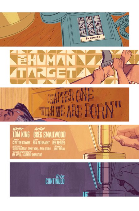
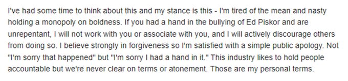
Sad to say that, without my approval, Marvel attempted to "fix" several panels of my art in issue two of Elektra: Black, White, & Blood before sending it to the printers. They're not huge changes but I really don't like my art being tampered with.
There is still a persistent myth out there that you can achieve photo realism in art without the use of photo reference. If your goal is realism, here's a thread to remind you that the best artists used reference so you can, too.
And if tracing photos makes your work look stiff, get better at tracing photos. Don't get bogged down in details and instead train yourself to see the broad strokes and forms. Focus on body language and not the intricate clothing folds.
Just wanted you all to know because my name is on that comic but I'm pretty annoyed about how it looks. As a palate cleanser, here's the cover and the first two (also the best) pages, unaltered.
Long story short - 2 months after turning in the finished pages, I was informed by my editor that Marvel's Standards & Practices flagged my art and requested I redraw several panels so that they would be "within tolerance for best representation of Asian characters."
I've got a newborn, a three-year old, and some tight deadlines to manage right now so this is all I'm saying on the matter. Going back into my hole again.
Wife and I were expecting our second child the following week and I was racing to finish an issue of HT before the birth so I told Marvel that I didn't have time to make the changes but that I would be perfectly fine with them pulling the story for sensitivity concerns.
My all-time favorite MK run is Jeff Lemire and Greg Smallwood's brilliant "Welcome to New Egypt." Also "From The Dead" by Warren Ellis and Declan Shalvey. Both huge inspirations for the show.
Unfortunately, I just found out yesterday that the folks at Marvel didn't even bother using my new art and instead went to print with their own revised pages. I was not given a chance to make further revisions or even approve the alterations made by the bullpen.
I stated very clearly that I didn't want anyone touching my art so I dropped everything I was doing and immediately reworked all of the panels that were flagged.
With the new issue of Human Target hitting stands next week, I thought it would be a good time for another process thread. This one concerns what I consider the most important element of my work on HT - contrast.
Let's start with comics. Here's the creator of the Rocketeer, Dave Stevens posing for Cliff Secord himself. Fellow comics artist Doug Wildey was Dave's model for Peavey.
Pretty absent from Twitter lately but I've been busy going back and drawing more fingers on hands for these last few issues of Human Target. Not usually one for jumping on trends but I really don't want to miss out on this brand new audience who digs extra digits in their art.
Paolo Rivera is wonderfully open about all of the reference material he uses. I've learned a lot from the information he's generously shared over the years.
Richard Corben used a lot of models (fellow creator Bruce Jones is recognizable in some of Corben's work) but he also went the extra mile and sculpted stylized heads for realistic lighting ref.
I'll miss drawing these two. Many thanks to Tom for giving me gold every time. Many thanks to Clayton for his patience and skill. And many, many thanks to Ben for making it all happen. Until next time, folks!
Some folks were wondering about the "Apologies to Darcy" on the cover to Human Target 2. That's a reference to Ernest "Darcy" Chiriacka, a mid century illustrator I swiped from for the cover.
I have a cheap flask that I use for Human Target. Why? Because if you add up the amount of time I've saved just tracing a photo of it, it's paid for itself 10x over. If you're going for photo-realism and you're on a deadline, you've got to cut every corner you're able to.
Adam Hughes did a fantastic piece for ImagineFX that went over his process, including some of his photo reference. TwoMorrows also ran a great photo of Adam with his WW model, Julie Rapp, in issue 21 of Comic Book Artist magazine.
Also, instead of feeling guilty for doing what most professional artists have done throughout history, just be grateful you don't have to set up an elaborate camera obscura or a clunky artograph to do your tracing. You can just open up Photoshop. Or buy a cheap lightbox on Amazon
First three Human Target covers by Goddamn
@SavageSmallwood
. These are the last days to preorder if you want one in case they sell out. And looking at them now, I think they’re going to sell out.
168 pages down, 168 to go. The hugely supportive folks at DC are putting Human Target on a short hiatus so that I can finish the second half of the series. For anyone who missed the first half, they'll be releasing a hardcover of 1 thru 6, out in September (a week before Issue 7)
Here's my cover for Tales of the Human Target, an anthology one-shot that drops Aug 23. I handle a lot of design for the HT series but I had no formal training so everything I've learned is thanks to the amazing resources that are available out there. Here's a thread about them.
As soon as I took the Elektra gig, I went on Amazon and bought some cheap sai because I knew I was going to draw them a lot. Also sculpted a quick Elektra model so I wouldn't have to worry about consistency when drawing her over & over. I just traced the model over & over instead
Can photo reference and 3D models be relied on too heavily and produce work that is lifeless? Absolutely! But I've also seen plenty of stiff, lifeless art produced without the use of photo reference, too. Like any art tool, it's about how you use it.
Speaking of, Parker was part of the Famous Artist School and there's a whole lesson on research and reference. Even a section on how to shoot photo reference.
I didn't know Ed Piskor but I wish I had. Cartoonist Kayfabe kept me going when I was ready to quit. He & Jim gave so much of themselves to comics and we repaid them with cruelty. Wish I had spoken up, even if it's vanity to think I could've made a difference.
I'm sorry, Ed. RIP
Very grateful for Human Target's Best New Series Eisner nom. Thank you! Sometimes comic books, much like children, come into this world kicking and screaming. Took me a few tries to find HT's visual voice but the reception we've received has made the work worth it.
Speaking of Frazetta, Arnie Fenner wrote a great piece for Muddy Colors on the subject of photo reference that discusses the stigma around reference/tracing and Frank's use of it.
Line art for Human Target uses three distinct styles. Soft & highly rendered inking/penciling for faces & skin, loose & simplified brush strokes for clothing, and blotty dead lines for backgrounds. When combined, they subtly contrast each other.
So stop holding yourself to some impossible standard and break out the camera if you think it'll help. Go buy that prop if it'll help you make your deadline (or come close). And if it saves time, TRACE THE PHOTO.
Not miscommunication. NO communication. Devin apologized to me yesterday for not being able to respond to my emails concerning the edits (some kind of server error on his end). He was not apologizing for the changes. He assured me yesterday that I would be happy with them.
@SavageSmallwood
So sorry, Greg, we’ll own the mistake here. Had an email miscommunication on my end, like we spoke about yesterday. As we already assured you, we’re using your pages on digital editions and any new printings and collections.
And just as a disclaimer, this doesn't mean ALL artists should use reference. Your style dictates your tools. If your work is hyper-stylized, photo ref would be mostly worthless to you. I doubt Jack Kirby needed or used much photo ref by the time he was on FF.
Here's my variant cover for issue 14 of THAT TEXAS BLOOD (out this week!) by
@ChristophCondon
&
@jacobr_phillips
. For you digital artists out there, I thought I'd share a few things in Photoshop that I used to make this cover.
Mostly, you should try to find a process that best suits you. I find it difficult to picture things in my mind clearly and I work a lot better when I'm looking at something. I also naturally gravitate towards realism so photo ref makes sense for me.
I'm done pretending that an apology or atonement gets you anywhere with these people. Tell me, Liam - did an apology change Warren Ellis's circumstances? How about Jason Latour's? Cameron Stewart? Brian Wood? There is no path and you know it.
I've experimented a lot with the traditional forms of contrast - color, shape, texture, etc but after really studying mid century illustration, I realized that there was a very powerful contrast technique that I wasn't taking advantage of - style contrast.
Well, that's it for me. If you missed the first six issues of HT, you can pick up the volume one hardcover collection next week, too. Big thanks to
@ComicMama
for giving me the opportunity to help with the design of the book. Had a blast with it!
To contrast the tight rendering on faces, I don't render the colors but apply hard angular cuts for the shading. And like the blocky coloring on 101 Dalmatians, I keep things loose and frequently color outside the lines.
But that's not what the folks at Disney did. They contrasted that precision with loose, blocky, and seemingly haphazard coloring. The juxtaposition of two contrasting approaches is instantly appealing.
But unlike Dalmatians, I try as often as I can to keep the underlying hues of shadow and light in any given panel complimentary. Or at the very least, I push the light as warm as I can and the shadows as cool as I can.
I wish I had time to tackle more covers these days but I don't. For this book, I made time. Twice. Preorder the book - it's
@TomKingTK
@BilquisEvely
&
@_matlopes_
at their very best.
This is the last weekend to preorder Helen of Wyndhorn, my new series with
@BilquisEvely
, following up on our Supergirl Woman of Tomorrow. It's epic fantasy meets Gothic mystery. But mostly it's game changingly beautiful. If you liked Supergirl, if you wanted more, this is more.
The folks at DC were kind enough to let me handle trade dress for the cover so I worked that up before shooting some quick photo reference and inserting my Christopher Chance head sculpt (made in Sculptris and lit in 3D Viewer).
On the left is the art I did to accompany Tom's pitch for the book. A few months later, I revisited the piece and worked up something closer to the tone and style of my interior art.
Contrary to popular belief, I did not steal Mitch Gerads's likeness for G'Nort. That said, I'm not above stealing from Mitch. Many thanks and apologies to
@MitchGerads
for every little thing I've swiped from him in Human Target.
I attempted to emulate that with my Gotham City Year One cover. Pull focus to the faces (and gun) by tightly rendering them and pulling focus away from the rest of the cover by loosely rendering it.
It's the same reason this Mitchell Hooks cover is so pleasing to the eye. Hooks rendered the faces with precision but the clothes and fabric are defined with loose and carefree strokes.
I also try to push the contrast between stylization & realism as much as I can, as often as I can. I could have rendered the grass or the flame more realistically but it wouldn't pop. It's also a lot easier to let a K. Webster brush do the work (Winter Stix for the grass, btw)
Austin Briggs explored this kind of contrast in his later career. You can see the solid foundation in his work...he was a master at anatomy, faces, composition...but he completely layers that mastery w/ rendering that could be mistaken for a sketch or the scribblings of a child.