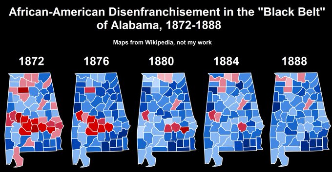
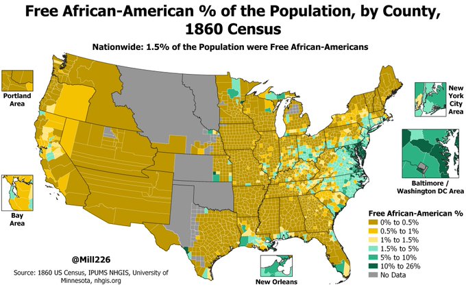
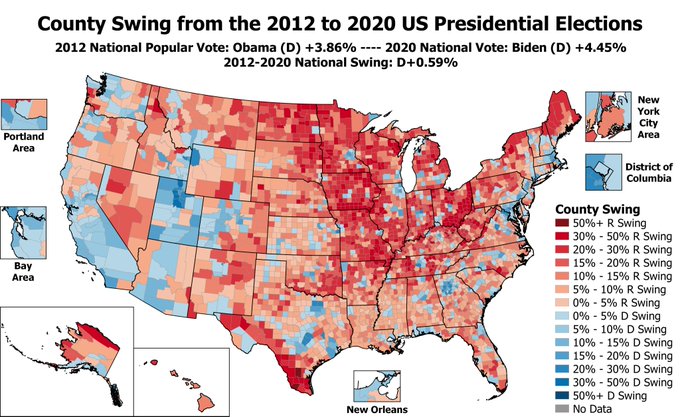
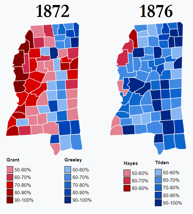
Mill Profile Banner
Mill Profile
Mill

@Mill226

3,350
Followers
1,593
Following
5,454
Media
17,492
Statuses

Map Maker, He/Him

Joined September 2019
Don't wanna be here? Send us removal request.
Pinned Tweet
@Mill226
Mill
3 years
Map of estimated turnout of the adult population in the 1940 US Presidential Election. The strong effects of Jim Crow voting restrictions & poll taxes are visible (see the WV/VA border!), with less than 10% of the adult population voting in some Southern counties (dark orange):
Tweet media one
41
255
1K
@Mill226
Mill
2 years
@ConceptHuman 2012 was way better
Tweet media one
153
820
20K
@Mill226
Mill
1 month
I volunteered for her once in 2013, was making calls when suddenly a man in a dirty pink bunny suit walked into the campaign office, knocked over a bookshelf, & ran off I asked "what the hell?" & they said "oh it's the Anarchists trying to sabotage us because we're electoralists"
@McKay4Senate
Bill McKay
1 month
It's so cool that we had a Trotskyist city councilwoman in one of the most expensive cities in the United States and she resigned to form a "national movement" called Workers Strike Back that mainly just runs a podcast.
Tweet media one
41
72
2K
38
473
9K
@Mill226
Mill
6 months
With 2024 approaching, an important reminder for all the mules out there: Always remember not to round your results when committing voter fraud
Tweet media one
53
817
8K
@Mill226
Mill
11 months
This "Confederate Diaspora" paper has a cool map of the % of Southern-Born Whites outside the South in 1900 They seemed to really avoid the Upper Midwest states of MN, WI, & MI, & the North-East.
Tweet media one
@MattGrossmann
Matt Grossmann
11 months
white migration out of the postbellum South diffused & entrenched Confederate culture across the United States. These migrants laid the groundwork for Confederate symbols and racial norms to become pervasive nationally in the early 20th century.
21
132
858
99
574
5K
@Mill226
Mill
1 year
Tweet media one
1
105
2K
@Mill226
Mill
1 year
This is the ideal economy. You may not like it, but this is what peak performance looks like:
Tweet media one
12
138
2K
@Mill226
Mill
2 months
Tweet media one
7
179
2K
@Mill226
Mill
11 months
"Confederate Culture Index" was defined as the sum of county-level indicators of Confederate memorials, United Daughters of Confederacy chapters, 2nd Ku Klux Klan chapters, & lynchings of African-Americans in the post-1900 period. Southern CA had a lot of "Confederate" influence:
Tweet media one
48
194
2K
@Mill226
Mill
1 year
HISTORICAL?? The party has existed for 18 months!! This is the equivalent of a 16 year old doing their "my political ideology by year" tweet
Tweet media one
15
40
2K
@Mill226
Mill
4 years
@rebekahentralgo @Polit_eurOpines It was the best of times
Tweet media one
16
107
1K
@Mill226
Mill
1 month
Like this type of bunny suit, full head and everything. But very scuffed up
Tweet media one
2
3
1K
@Mill226
Mill
7 months
Cornel West on deciding not to seek the Green Party nomination: “The procedures and requirements for debate, you have to go to various Green Party events in a variety of different states. … I said, ‘Oh my God, this is a lot of energy and time and effort'”
189
103
1K
@Mill226
Mill
3 years
OOF, Michigan Redistricting Commission dropped their proposed map & it's BRUTAL for Democrats:
Tweet media one
39
49
964
@Mill226
Mill
2 months
Tweet media one
17
25
931
@Mill226
Mill
3 years
A 1949 Gallup poll asked Americans if they thought these scientific achievements would happen by the year 2000: "A cure for cancer will be found?" 88% Yes, 7% No "Trains/airplanes will be run by atomic power?" 63% Yes, 20% No "Men in rockets will reach the moon?" 15% Yes, 70% No
15
128
841
@Mill226
Mill
1 year
GIF Map of which Party controlled each State Government, from 1973 to 2023:
14
128
845
@Mill226
Mill
4 years
@scienceshitpost when you bid too high on the fishe:
Tweet media one
Tweet media two
1
26
814
@Mill226
Mill
3 years
@zuza_real This is Mr Mouse all over again
7
69
784
@Mill226
Mill
3 years
Tweet media one
1
45
782
@Mill226
Mill
11 days
Tweet media one
1
27
755
@Mill226
Mill
4 years
Tweet media one
1
40
632
@Mill226
Mill
2 months
@MiddleearthMixr Farmer Maggot protecting Frodo
Tweet media one
2
8
620
@Mill226
Mill
4 years
Tweet media one
4
28
553
@Mill226
Mill
3 years
Bob Dole's campaign logo was so sick:
Tweet media one
11
15
502
@Mill226
Mill
1 month
@willmduff it really did happen, i wish i had some proof beyond just telling people over the years, tho apparently other people have heard this story too:
@clapifyoulikeme
Mrs. Detective Pikajew, Esq.
1 month
@Mill226 @nikicaga Wait I’ve heard this story before
1
0
122
1
0
486
@Mill226
Mill
4 years
#ElectionTwitter Map of which Party/Presidential Candidate got the highest % of the vote ever in each state, from 1868-2016. This isn't an average, but just the single highest % achieved by any candidate in each state. SC sets the record with 98.6% of the vote for FDR in 1936.
Tweet media one
37
116
452
@Mill226
Mill
3 years
2020 US House Election but it's Canadian:
Tweet media one
31
39
400
@Mill226
Mill
2 years
We don't talk about this election enough:
Tweet media one
24
9
377
@Mill226
Mill
7 months
“Dissatisfied with current immigration levels, but want the levels to remain the same” voters:
Tweet media one
@DrewSav
Drew Savicki
7 months
Thermostatic opinion
Tweet media one
1
2
47
4
22
397
@Mill226
Mill
2 years
To save US democracy we need to emphasize more issues that will depolarize the electorate, like “should Canadians be allowed to own property?”
Tweet media one
11
24
376
@Mill226
Mill
3 months
Thatchers ability to be horribly unpopular EXCEPT when there was an election was crazy
Tweet media one
@RealLiv04
Liv
3 months
First off this evening, Conservative Party leader approval ratings from 1938 to 2024
Tweet media one
2
3
42
8
16
383
@Mill226
Mill
4 years
The RI Democratic Party is awful so it's good to see some D incumbents losing their primaries. Example of RI Dem awfulness: in 2014 the RI state legislature, which had Democratic super-majorities, passed a Voter ID Law & a bill banning municipalities from raising the minimum wage
@Taniel
Taniel
4 years
Wow. Big early results for the left in Rhode Island. Right now, there are **8** Dem incumbents who are trailing primary challengers from their left. They include the state Senate President, & the senator who compared abortion rights to Satan.
24
330
2K
5
62
345
@Mill226
Mill
4 years
3
37
353
@Mill226
Mill
9 months
Map of the estimated % of the population born in their state of residence, by county. Counties in green have a majority of the population born outside their state of residence, counties in yellow a majority were born in-state. Nationwide 58.1% live in the state they were born:
Tweet media one
15
71
348
@Mill226
Mill
2 years
70% of respondents in a 1954 Gallup poll agreed that comic books were at least partly to blame for teenage crime:
Tweet media one
20
64
315
@Mill226
Mill
3 years
Tweet media one
1
18
310
@Mill226
Mill
2 years
45% of FDR voters couldn’t correctly name his VP candidate (Harry Truman) in 1944. 6 months later FDR died & Truman became President.
Tweet media one
8
23
306
@Mill226
Mill
7 months
Antarctica: Libertarian Stronghold
Tweet media one
12
22
313
@Mill226
Mill
1 year
2
39
298
@Mill226
Mill
3 years
Tweet media one
1
23
279
@Mill226
Mill
3 years
It ain't much, but it's honest work
Tweet media one
1
49
281
@Mill226
Mill
3 years
Map of the average swing towards or against Incumbent Presidents, by county. Most pro-incumbent counties (yellow) are Alaskan Native areas, heavily Hispanic South TX, much of the Deep South, & upstate NY. The most anti-incumbent areas (green) are in the Great Plains & Western US:
Tweet media one
17
46
278
@Mill226
Mill
1 month
@clapifyoulikeme @nikicaga I’ve told it to a few people, I assume the kshama people told it too
1
0
285
@Mill226
Mill
2 years
Lib Dems voting unanimously against vaccine passports seems surprising? Trying to win those rural by-elections?
Tweet media one
27
19
264
@Mill226
Mill
3 years
@PopulismUpdates Great for Dems in the Senate!
Tweet media one
0
10
261
@Mill226
Mill
4 years
Rare photo of Joe Biden with a beard, in Ireland, 1966.
Tweet media one
9
20
263
@Mill226
Mill
1 year
Thank god FDR ran for a 3rd term
Tweet media one
12
6
260
@Mill226
Mill
2 years
GIF Map of which Party controlled each State Government, from 2000 to 2022:
8
45
256
@Mill226
Mill
3 years
Map of Ancestrally Democratic/Republican counties. There are many different ways you could measure/define which counties are ancestrally Democratic/Republican, but I used a measure suggested by @SpecialPuppy1 : the average 2-party PVI from the 1948 to 1984 Presidential Elections.
Tweet media one
18
46
254
@Mill226
Mill
2 years
@Conblob 👏make👏Manchin👏watch👏you👏take👏a👏dump👏
2
1
255
@Mill226
Mill
4 years
#ElectionTwitter Map of which Democratic Presidential Candidate got the highest % of the vote in each county, from 1972-2016. Carter's run in 1976 (colored red) achieved the highest Democratic % in the most counties, 2,010 in total, many in areas that are very conservative today.
Tweet media one
24
53
249
@Mill226
Mill
3 years
In May 1941 Gallup asked Americans how they would vote on the US entering WW2. Only 21% said they would vote to enter the war. WI was most opposed to entering, with only 14% support, while FL was most supportive at 35%. States colored by above/below average (21%) war support:
Tweet media one
9
48
238
@Mill226
Mill
2 years
There was a poll in June 1992 that showed Ross Perot leading with 39% of the vote, followed by George HW Bush at 31%, & Bill Clinton in 3rd at 25%. Made a map of the 1992 election if that poll had come true, using proportional swing. Perot dominates outside the Southern states:
Tweet media one
12
42
239
@Mill226
Mill
2 years
There's a pretty strong correlation (R^2=0.525) between the # of UFO sightings per capita in a state & the % of the vote a state gives to 3rd-parties:
Tweet media one
7
47
240
@Mill226
Mill
1 year
Tweet media one
0
10
237
@Mill226
Mill
2 years
Starting to play around with the 2020 Census Data 8 Mile Road in Detroit is one of the more famous markers of residential segregation in the US; with Detroit to the south & the Macomb suburbs to the north. But the stark racial border seen there in 1990 has faded somewhat by 2020:
4
32
223
@Mill226
Mill
1 year
what is the point of this party 😭
Tweet media one
12
2
224
@Mill226
Mill
1 month
@AmeliaMakesMaps Yeah I’m 100% serious, really happened! I don’t remember the exact wording of our conversation after but that was the gist of it
3
0
240
@Mill226
Mill
1 month
TRUE STORY It was so long ago I was sort of second guessing my memories tbh... 11 years ago when I was 21, and it was so surreal in the moment
@PhilipLocker
Philip Locker🌹
1 month
I forgot about this, but I can attest this is a true story, I was there and witnessed it! Seattle Anarchists were very angry at us for fighting for Occupy to take up concrete demands in 2011 and then running in 2012 & 2013 elections
6
11
208
0
2
237
@Mill226
Mill
3 years
I ran a simple regression model on 2020 Presidential results using age, education, income, & race as predictive variables. The model had an R^2 of 0.73, counties in purple are where Biden did better than the model would have expected, orange where Trump did better than expected:
Tweet media one
30
36
226
@Mill226
Mill
3 years
County swing maps in Incumbent Presidential Elections (left side, 2020 & 2012): 🥱😴 County swing maps in Open Seat Presidential Elections (right side, 2016 & 2008): 😱🤩
Tweet media one
Tweet media two
Tweet media three
Tweet media four
9
55
205
@Mill226
Mill
3 years
Disenfranchisement of African-American voters in the South after Reconstruction didn't happen suddenly, instead was a gradual process of violence/intimidation/restrictions Maps from Wikipedia show that even as late as 1884 Black voters carried 3 "Black Belt" counties for the GOP:
Tweet media one
1
56
225
@Mill226
Mill
8 months
Map of the free African-American % of the population in 1860 by County. 1.5% of the population of the US was made up of free African-Americans in 1860 (Census was 85.7% White and 12.6% enslaved persons) Green are counties with above-average (>1.5%) Free Black %, yellow below avg:
Tweet media one
11
44
228
@Mill226
Mill
3 years
Boring USA: "Democratic Party", "Republican Party" Based Samoa: "Human Rights Protection Party", "Faith in the One True God Party"
Tweet media one
3
8
210
@Mill226
Mill
3 years
In 2012 Obama won re-election by a 3.9 pt margin; in 2020 Biden defeated Trump by a similar 4.5 pt margin. Map is of the county swing from 2012-2020, Biden mostly gained over Obama in urban/suburban areas while Obama did better in most rural counties (especially in the Midwest):
Tweet media one
15
51
217
@Mill226
Mill
3 years
can't believe this was 2 years ago
Tweet media one
1
14
224
@Mill226
Mill
2 years
My own Mandela Effect is that I remember Biden being up way more in the PA polls going into election day? They nailed the margin exactly??
Tweet media one
15
5
212
@Mill226
Mill
1 year
The Senate is looking at closing a cryptocurrency tax loophole to pay for the "Recovering America's Wildlife Act" bill. Provides $1.4 billion per year for conservation of species, would be the biggest wildlife bill since the Endangered Species Act of 1973.
3
29
215
@Mill226
Mill
3 years
Cheeky Biden moment from the 2008 debates:
4
22
206
@Mill226
Mill
1 year
Map of the % of the population without health insurance, by county, 2017-2021 estimates. National uninsured rate was 8.8%. States outlined in yellow/green either haven't expanded medicaid (yellow), or didn't expand medicaid until part-way thru the 2017-2021 survey period (green):
Tweet media one
8
45
213
@Mill226
Mill
2 years
In June 1980 a poll came out showing Independent candidate John B. Anderson at 24% of the national vote, behind Jimmy Carter's 35% & Ronald Reagan's 33%. Made a map using proportional swing of what that result would look like by county, Anderson notably wins many college towns:
Tweet media one
11
27
203
@Mill226
Mill
3 years
Many people have already made this map, but I felt I had to make a 2016-2020 Swing map as well. Voting patterns were mostly stable, with 74% of counties having a swing of less than 5 pts towards either party from 2016. There were big shifts in areas like the RGV & Atlanta Suburbs
Tweet media one
11
44
198
@Mill226
Mill
1 year
1
0
208
@Mill226
Mill
1 year
In 1860 New York gave Abraham Lincoln 54% of the vote, while at the same time rejecting a referendum which would have given equal voting rights to Black New Yorkers, with 64% voting NO on equal suffrage Biggest gaps between Lincoln's vote & Equal Suffrage vote were in Eastern NY:
Tweet media one
13
43
206
@Mill226
Mill
2 years
0
47
199
@Mill226
Mill
2 years
Carter's 76 campaign targeted rural White voters in Mississippi by saturating country radio with an ad combining "Dixie" & audio of George Wallace's endorsement: "if Jimmy Carter loses this election, it will be the last opportunity for someone in the South to win the White House"
Tweet media one
Tweet media two
7
20
197
@Mill226
Mill
2 years
2020 election by county with European Colors:
Tweet media one
@AmericaElige
America Elects
2 years
USA, Beacon Research/ Shaw & Company poll: House of Representatives election Republican Party (Right): 47% (-3) Democratic Party (Liberal): 47% +/- vs. 10-13 July 2022 Fieldwork: 6-9 August 2022 Sample size: 1,002 #USA #Biden
Tweet media one
8
3
105
6
16
197
@Mill226
Mill
2 years
Map of the average # of vehicles per household, by County (Census estimates) The average nationwide is 1.8 vehicles per household. Counties in yellow have above an above average # of vehicles, while counties in green have a below average # of vehicles:
Tweet media one
19
39
203
@Mill226
Mill
2 years
Regressed US vaccination rate by county on 2020 Presidential Margin & mapped the residuals. Areas in green are where vaccination is higher than expected based on 2020 votes, yellow lower than expected. Not every vaccination is reported by county so data is noisy, missing in areas
Tweet media one
22
46
197
@Mill226
Mill
3 years
Thread of primary candidates who won exactly 1 county. 2020: Tom Steyer (D), Mineral County NV (colored orange on map)
Tweet media one
Tweet media two
9
17
195
@Mill226
Mill
3 years
Starr County TX is 96% Hispanic, & 96% of Hispanics in Starr identified racially as "White" on the Census. It swung 55 pts towards Trump. In contrast, in Imperial County (80% Hispanic) only 56% of Hispanics identified as White & it swung only 17 pts Trump
@Mill226
Mill
4 years
The US Census treats Hispanic/Latino origin as an ethnicity separate from racial identity. So if you choose to identify as Hispanic, you must still pick a race: White, Black, Asian, etc. I mapped which racial category the plurality of Hispanics chose on the 2010 Census by county:
Tweet media one
4
15
78
5
29
186
@Mill226
Mill
1 year
Charted the Republican % of the vote in Mississippi in 1872 & 1876 (maps from Wikipedia) White Democrats violently took over the state government in 1875. 4 Black majority counties went from giving Grant 70%+ of the vote in 1872 to giving Hayes 0-1% in 1876 due to violence/fraud:
Tweet media one
Tweet media two
3
38
186
@Mill226
Mill
1 year
Democrati vs Repubblicani
Tweet media one
6
10
184
@Mill226
Mill
3 years
Map of the 100 year swing from the 1920 to 2020 Presidential Elections. In 1920, Harding (R) won a 26 pt landslide, currently Biden (D) is winning by 4 pts, so nationally there was a 30 pt Dem swing over 100 years. GOP gained in most of the South, Dems on the WestCoast/Midwest/NE
Tweet media one
10
30
179
@Mill226
Mill
3 years
Each recent Democratic President ran into a moderate Democrat who was a pain in the ass in terms of passing his agenda: Joe Biden has Joe Manchin, Barack Obama had Joe Lieberman, Bill Clinton had Bob Kerrey, & Jimmy Carter had himself.
Tweet media one
Tweet media two
Tweet media three
Tweet media four
11
10
183
@Mill226
Mill
4 years
Thread: Chinese % of the population, 1870. The Chinese population in the Western US began to rise after the CA gold rush of 1849. Chinese immigrants worked in the mines, agriculture, or the railroads. Most came from Southern China, escaping the aftermath of the Taiping Rebellion.
Tweet media one
2
41
185
@Mill226
Mill
2 years
Tweet media one
0
1
181
@Mill226
Mill
3 years
Each 2020 candidate's best nation* in the "Democrats Abroad" Primary: Sanders: South Korea (84%) Biden: Panama (45%) Warren: Peru (26%) Bloomberg: Israel (9%) Buttigieg: Luxembourg (4%) Gabbard: India (3%) *Minimum 50 votes cast
Tweet media one
13
22
180
@Mill226
Mill
4 years
538 had a tool in 2016 where you could adjust the turnout and % of the vote each Party got from demographic groups to see which states would flip. I maxed turnout at 100% & gave 100% of the White College-Educated + Non-White vote to Dems & 100% of the White Non-College to the GOP
Tweet media one
10
17
180
@Mill226
Mill
2 years
Map of which 3rd-Party/Independent Presidential candidate got the highest % of the vote by county, 1968-2020. Perot (green) & Wallace (orange) set the record in the vast majority of counties. McMullin (blue), Johnson (yellow), Anderson (red), & Hagelin (purple) place in the rest:
Tweet media one
10
36
178
@Mill226
Mill
3 years
Re-made my map of the 2016-2020 swing by county, but using 2-party swing (left map) as opposed to absolute swing (right map) The biggest difference on the 2-party swing map (which removes 3rd-party votes from the calculation) is that Mormon areas of UT/ID swing Dem instead of GOP
Tweet media one
Tweet media two
9
29
176
@Mill226
Mill
1 month
1872 was the most peaceful election of the Reconstruction era, and the fairest in the South until 1968 President Grant (R) won the popular vote in the Ex-Slave states by 2.8% over Horace Greeley (Liberal Republican/Democrat) Yellow counties had African-American majorities in 1872
Tweet media one
3
38
183
@Mill226
Mill
4 years
Nobody's up, time to post the worst map I ever made
Tweet media one
4
32
171
@Mill226
Mill
2 years
Vote yellow no matter the fellow
@Mill226
Mill
2 years
2020 election by county with European Colors:
Tweet media one
6
16
197
3
5
166
@Mill226
Mill
1 year
America if the Gore campaign didn't cancel his boat trip tour through SE Florida:
Tweet media one
1
8
169
@Mill226
Mill
3 years
@aidan_smx They used to be so good
Tweet media one
Tweet media two
2
3
170
@Mill226
Mill
3 years
The Electoral Map looked a lot different 100 million years ago. Democrats didn't have to worry about the South, & the conservative Mountain West was mostly volcanoes. On the other hand, they lost a lot of coastal liberal votes:
Tweet media one
12
19
163