
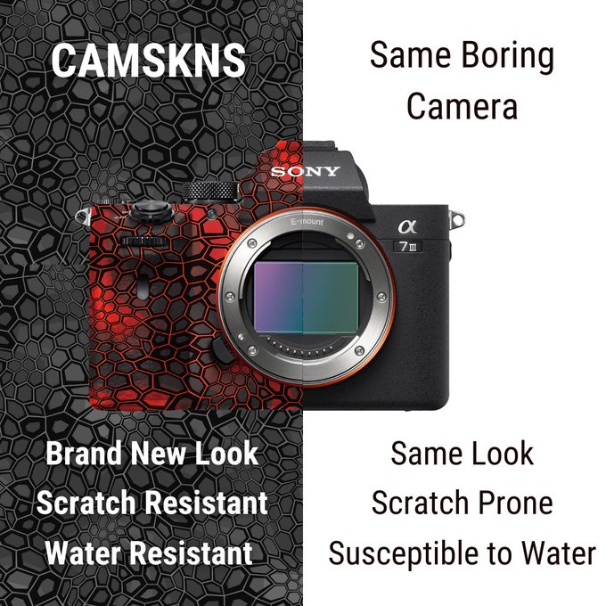
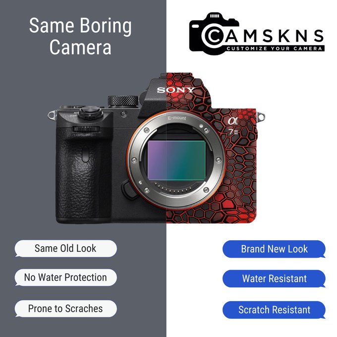
DTC and E-commerce Twitter. Pick apart the ad I'm about to run. Drop your suggestions in the comments.
Be brutal, I read my own Facebook ad comments, I can take it.
21
1
45
Replies

@ColinDougherty_
use a GIF with a slider going back and forth showing more of the before and after - also more eye catching
change bullet point text to the instagram text bubbles
some other great points already said here too
1
0
5

@suibianmian
hahaha holy shit I need to use this for copy, I'm not sure how many people would get it
0
0
2

@ColinDougherty_
Those doesn't really hit the appeal. I'd drop:
- logo
- all text
Can you please link the landing page? Start with writing copy & doing the relevant research. The idea for the ad should come AFTER the copy.
Other than practical (water proof) i don't see the "cool factor" 🤷♂️
1
0
0

@ColinDougherty_
Try making the background of the left side a flat dark gray to help the skin and text pop. Also try removing the 3 points at the bottom to let the skin do the talking. 3 variants to test.
3
0
10


@ColinDougherty_
I'd like to see the whole background white. The skin should pop. Bigger, take up more space with the camera. Show it off! Make copy about the benefits rather than comparing. Start with "protect your camera"...b/c I think it's obvious so hit us w/investment.
0
0
0

@ColinDougherty_
Too much text do you really expect me to read that my attention span is .4 seconds
0
0
0

@ColinDougherty_
There is too much going on here. I don’t instantly understand the pitch. Boil it down to one key point of comparison.
0
0
0

@ColinDougherty_
I never understood comparison ads for products like this. Comparing is usually a bad idea, to begin with, but if it can work, it's with in-line products rather than an additional-to product such as Camskns. I'd spend more time focusing on the personality element.
2
0
4

@ColinDougherty_
I’d run a video creative and emphasise on feelings of have those features. And especially benefits. Otherwise it’s meaningless and hard to crack a cold audience.
0
0
0
@ColinDougherty_
And if you really have a big budget here is an idea: theme adventure, jungle
Showing difference between a classic camera owned by a boring researcher taking photos of boring stuff
Vs an adventurer owning the cool camera and capturing the most mesmerising moment in jungle
0
0
1

@ColinDougherty_
Hey brother make sure to check your website UX as well! Seems a bit cluttered and the 15% off covers the sticky cart!

1
0
0

@ColinDougherty_
very non scientific answer - as i was scrolling i saw the image, thought “oh camera skins that looks cool - i’m not gonna read all that” and was going to scroll past when i thought it was a twitter ad 😅
0
0
1
