
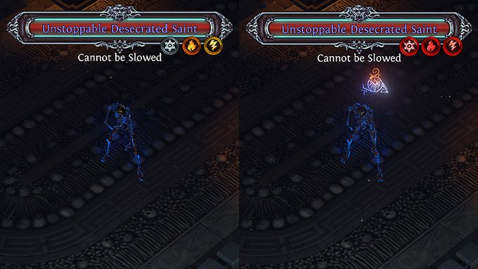
Here's what the new monster resistance icons look like when a monster is resistant to an element and when it's vulnerable to an element
192
70
2K
Replies

@pathofexile
As a colourblind person, I can't tell at all which one means resistant and which one means vulnerable. I would suggest putting resistant icons on the left hand side, vulnerable icons on the right hand side.
20
0
646


@pathofexile
I also agree with the previously suggested change is to move the locations & add colorblind settings "left vulnerable, right resistant" I would also change the icon coloring slightly on the inner circle so its not blending with the border. Here are 3 examples I tossed together.


2
1
26

@pathofexile
Very cool, but I think fire vulnerability and resistance looks a little too similar
0
0
12


@pathofexile
Small tweak - Have resistances on the left-hand side of the nameplate, and vulnerabilities on the right to avoid clutter/confusion
0
0
3


@pathofexile
idk if i'll ever notice this when mapping but for bosses it could be useful. Any colourblind support?
0
0
50

@pathofexile
Can you move the chr buffs from the top left? If you have too many you can’t read them cuz of monster hp bar
0
0
2


@pathofexile
Good addition but still difficult to read. Positive resist icons should be on the left of the text, negative on the right. Making the icons on the right completely red obfuscates the icons.
0
0
8


@pathofexile
I like it. But I think it would be better if it was resistances to one side and vulnerabilities on the other in addition to the color coding.
0
0
2


