
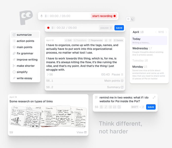
i think it's time to share some ui of Poi. overwhelmed by designing it on my own, so can't wait to share.
21
12
385
Replies

@danywander
Would all of these cards be arranged in one view like this or is that just for presentational purposes?
1
0
0

somehow i succeed in explaining my 7yo daughter what my job is. so now, she is actively trying to help :) draw me an icon for poi ❤️
12
1
216
1
0
6


@danywander
look awesome dany
i would love to see more of poi!
how is the design, use cases, share everything man haha
1
0
1

@danywander
Love the clean design here, can't see wait to see more! Also is that an index system like in Zettelkasten?
1
0
2


@danywander
You are indeed thinking different mate :)
Is Poi a research and organization tool?
1
0
1
@asapdesignco
thanks :)
Poi is a universal interface for memory. you can use it for research, notes, ideas, as well as an organization tool for your digital and physical touch points (even though there wouldn't be any folders and tags 😂)
2
0
1

@danywander
Love how clean it is! Only thing I would improve is making grey darker as it seems too "disabled", near April 10, for example, it is quite tricky to distinguish disabled and non–disabled buttons at a glance. Also, great playful layout of cards and Eye icon in April 19 :)
1
0
2


@danywander
Love the vibes! I'm not completely sure what it is even, but joining the waitlist!
1
0
1
@asapdesignco
thanks :)
Poi is a universal interface for memory. you can use it for research, notes, ideas, as well as an organization tool for your digital and physical touch points (even though there wouldn't be any folders and tags 😂)
2
0
1
0
0
0

