
121
140
2K
Replies

I’m not joking, viv’s style is so bad that somehow average body types look plus sized to fans. like no. they just have organs and ribs now.

69
2K
26K

@bionical_titi_
@jui_cyducks
@Cofering1
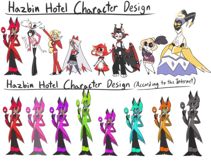
The difference is that both of these movies have way more body varieties than HH


8
53
3K

1
0
1
4
0
1K

@bionical_titi_
@echofighterr
@jui_cyducks
@Cofering1
There’s 1 obviously chubby person there and 1 that’s implied to be chubby and that’s it brother. The rest are stick thin
13
12
2K

3
14
4K

@bionical_titi_
@jui_cyducks
@Cofering1
congrats there's one "chubby" person and a few different heights. wow insane !
4
0
968

1
0
52

1
0
95

2
1
339

@bionical_titi_
@jui_cyducks
@Cofering1
one of the biggest critiques is the color palletes being to similar so idk why the bottom row is multicolored
3
2
685

1
1
105

1
0
40

@bionical_titi_
@jui_cyducks
@Cofering1
The designs are still ass
Like what is going on with husker? Far too messy, too much going on. What is he supposed to be? I don't get anything from these characters. There's not one, except Alastor, that I can look at and know "oh this their basic idea"
1
0
3

@bionical_titi_
@jui_cyducks
@Cofering1
I think it's better to have a cohesive palette, than have a billion bright almost neon colors just being characters in a normal setting.
2
0
1


@bionical_titi_
@jui_cyducks
@Cofering1
Body variety doesn’t only mean height btw. One chubby character doesn’t mean variety
2
0
49

@bionical_titi_
@jui_cyducks
@Cofering1
Theres only one fat character and they have no tummy, double chin, or anything else. It's just a conventionally attractive body type but a little wider.

1
0
2

@bionical_titi_
@jui_cyducks
@Cofering1
When four of your main character’s main colors are just hue shifted reds, that’s not fun to look at, especially when most of hell is just red background. This isn’t pleasing for the eyes. I’ve watched Hazbin, it’s a 4/10.


1
0
0

@bionical_titi_
@jui_cyducks
@Cofering1
Know? Sometimes I think they throw shit at HH because they hate Vivzi and not because they hate the series itself because it's always the bodies argument when SOUTH PARK does the same. And you could use your "they all look the same and blah blah blah" argument.

1
0
0